Personal attacks on Reddit A study of their impact on user activity
Resources
- The actual research paper is available here.
- Github folder with all the files is available here.
- The datasets subfolder includes the dataset (quittingFinalAnon.csv) and the bayesian chains resulting from the bayesian analysis.
- A pdf file with this walkthrough is available here and its R markdown source file is here.
Description
-
Exploration of the effects of online personal attacks on victims’ activity on social media (Reddit).
-
First large-scale (150K users who generated more than 180K comments), behavioral analysis that uses a high-precision Artificial Intelligence system and is not based on self-reported data.
-
Data analysis in R conducted from three perspectives: (1)~classical statistical methods, (2)~Bayesian estimation, and (3)~model-theoretic analysis with hurdle and zero-inflated models.
-
Personal attacks received online significantly decrease victims’ online activity.
Abstract. We conduct a large scale data-driven analysis of the effects of online personal attacks on social media user activity. First, we perform a thorough overview of the literature on the influence of social media on user behavior, especially on the impact that negative and aggressive behaviors, such as harassment and cyberbullying, have on users’ engagement in online media platforms. The majority of previous research were small-scale self-reported studies, which is their limitation. This motivates our data-driven study. We perform a large-scale analysis of messages from Reddit, a discussion website, for a period of two weeks, involving 182,528 posts or comments to posts by 148,317 users. To efficiently collect and analyze the data we apply a high-precision personal attack detection technology. We analyze the obtained data from three perspectives: (i) classical statistical methods, (ii) Bayesian estimation, and (iii) model-theoretic analysis. The three perspectives agree: personal attacks decrease the victims’ activity. The results can be interpreted as an important signal to social media platforms and policy makers that leaving personal attacks unmoderated is quite likely to disengage the users and in effect depopulate the platform. On the other hand, application of cyberviolence detection technology in combination with various mitigation techniques could improve and strengthen the user community. As more of our lives is taking place online, keeping the virtual space inclusive for all users becomes an important problem which online media platforms need to face.
Remark. In what follows, we sometimes display key pieces of code and explain what it does. Some not too fascinating pieces of code are supressed, but the reader can look them up in the associated .Rmd file and compile their own version.
Contents
- Resources
- Description
- Technology applied for personal attack detection
- Exploration
- Classical estimation
- Bayesian estimation
- Model-theoretic analysis
- Regression to the mean?
- References
Technology applied for personal attack detection
For the need of this research we define personal attack as any kind of abusive remark made in relation to a person (ad hominem) rather than to the content of the argument expressed by that person in a discussion. The definition of ‘personal attack’ subsumes the use of specific terms which compare other people to animals or objects or making nasty insinuations without providing evidence. Three examples of typical personal attacks are as follows.
- You are legit mentally retarded homie.
- Eat a bag of dicks, fuckstick.
- Fuck off with your sensitivity you douche.
The detection of personal attacks was performed using Samurai, a proprietary technology of Samurai Labs.[1] The following figure illustrates how the input text (“ccant believ he sad ur an id10+…!”) is processed step-by-step utilizing both statistical and symbolic methods.
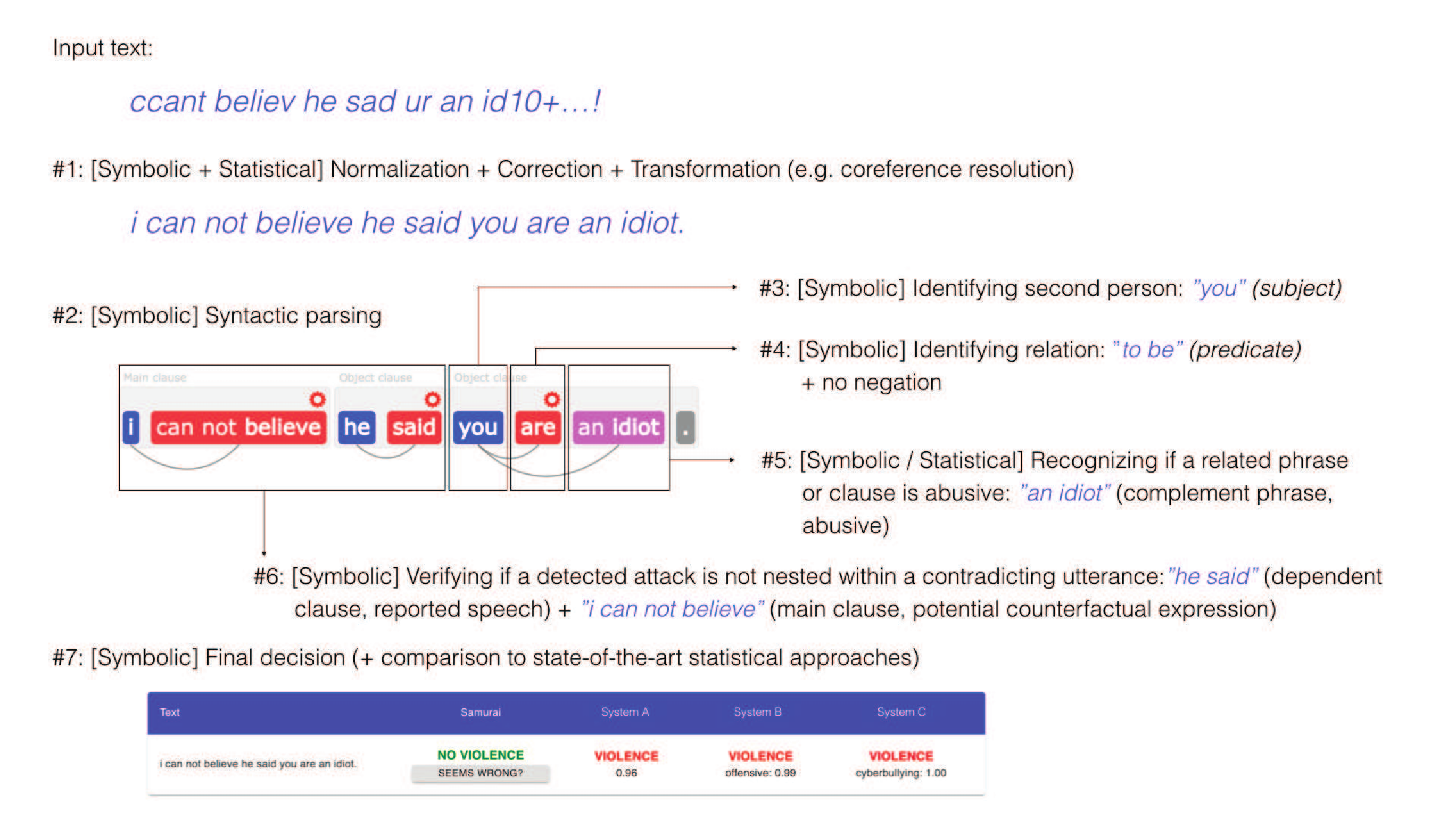
In practice, it means that a whole variety of constructions can be detected without the need to construct a fixed list of dictionary words defined . Due to utilizing symbolic components that oversee statistical components, Samurai recognizes complex linguistic phenomena (such as indirect speech, rhetorical figures or counter-factual expressions) to distinguish personal attacks from normal communication, greatly reducing the number of false alarms as compared to others systems used for violence detection. The full benchmark was presented in (Ptaszyński et al., 2018).
The detection models utilized in this research were designed to detect personal attacks targeted against a second person (e.g. interlocutor, original author of a post) and a third person/group (e.g., other participants in the conversation, people not involved in the conversation, social groups, professional groups), except public figures (e.g. politicians, celebrities). With regards to symbolic component of the system, by “models” we mean separate rules (such as, specifying a candidate for the presence of personal attack, such as the aggressive word “idiot,” which is further disambiguated with a syntactic rule of citation, e.g.,
"\[he|she|they\] said \[SUBJECT\] \[PREDICATE\]")
or sets of rules. The normalization model contains rules for transcription normalization, citation detection model contains rules for citation, etc. With regards to the statistical component, by “models” refer to machine learning models trained on large data to classify an entry into one of the categories (e.g., true personal attack, or false positive).
Moreover, the symbolic component of the system uses two types of symbolic rules, namely “narrow rules” and “wide rules.” The former have smaller coverage (e.g., are triggered less often), but detect messages containing personal attacks with high precision. The latter, have wider coverage, but their precision is lower. We decided to set apart the “narrow” and “wide” subgroups of the detection models in order to increase the granularity of the analysis. Firstly, we took only the detection models designed to detect personal attacks targeted against second person. Secondly, we used these models on a dataset of 320,000 Reddit comments collected on 2019/05/06. Thirdly, we randomly picked at most hundred returned results for each low-level model. Low-level models are responsible for detecting low-level categories. Similarly, mid-level models detect mid-level categories, by combining several low-level models, etc. (Some models are triggered very often while others rarely, so using all instances would create too much bias). There were 390 low-level models but many of them returned in less than 100 results. We verified them manually with the help of expert annotators trained in detection of personal attacks and selected only those models that achieved at least 90% of precision. The models with fewer than 100 returned results were excluded from the selection. After this step, the “narrow” subgroup contained 43 out of 390 low-level models. Finally, we tested all of the “narrow” models on a large dataset of 477,851 Reddit comments collected between 2019/06/01 and 2019/08/31 from two subreddits (r/MensRights and r/TooAfraidToAsk). Each result of the “narrow” models was verified manually by a trained annotator and the “narrow” models collectively achieved over 93.3% of precision. We also tested the rest of the “wide” models on random samples of 100 results for each model (from the previous dataset of 320,000 Reddit comments) and we excluded the models that achieved less than 80% precision. The models with fewer than 100 results were not excluded from the “wide” group. In this simple setup we detected 24,251 texts containing “wide” attacks, where:
- 5,717 (23.6%) contained personal attacks against second person detected by the “narrow” models,
- 8,837 (36.4%) contained personal attacks against second person detected by “wide” models,
- 10,023 (41.3%) contained personal attacks against third persons / groups.
The sum exceeds 100% because some of the comments contained personal attacks against both second person and third person / groups. For example, a comment ``Fu** you a**hole, you know that girls from this school are real bit**es” contains both types of personal attack.
Additionally, from the original data of 320,000 Reddit posts we extracted and annotated 6,769 Reddit posts as either a personal attack (1) or not (0). To assure that the extracted additional dataset contains a percentage of Personal Attacks sufficient to perform the evaluation, the Reddit posts were extracted with an assumption that each post contains at least one word of a general negative connotation. Our dictionary of such words contains 6,412 instances, and includes a wide range of negative words, such as nouns (e.g., “racist”, “death”, “idiot”, “hell”), verbs (e.g., “attack”, “kill”, “destroy”, “suck”), adjectives (e.g., “old”, “thick”, “stupid”, “sick”), or adverbs (e.g., “spitefully”, “tragically”, “disgustingly”). In the 6,769 additionally annotated Reddit samples there were 957 actual Personal Attacks (14%), from which Samurai correctly assigned 709 (true positives) and missed 248 (false negatives), which accounts for 74% of the Recall rate. Finally, we performed another additional experiment in which, we used Samurai to annotate completely new 10,000 samples from Discord messages that did not contain Personal Attacks but contained vulgar words. The messages were manually checked by two trained annotators and one additional super-annotator. The result of Samurai on this additional dataset was a 2% of false positive rate, with exactly 202 cases misclassified as personal attacks. This accounts for specificity rate of 98%.
The raw datasets used have been obtained by Samurai, who were able to collect Reddit posts and comments without moderation or comment removal. All content was downloaded from the data stream provided by which enabled full data dump from Reddit in real-time. The advantage of using it was access to unmoderated data (As of August 20th, the service is not available. For now, one possible way is to use an API provided by Reddit with a constraint: Reddit allows for 600 requests every 10 minutes. 10 minutes might be a short time in the case of moderators’ reaction, but is enough for AutoModerator or other automated moderation to exert their force, thus leading to a moderated, and therefore incomplete dataset.). Further, deployed their personal attacks recognition algorithms to identify personal attacks.
In the study, experimental manipulation of the crucial independent variables (personal attacks of various form) to assess their effect on the dependent variable (users’ change in activity) would be unethical and against the goal of Samurai Labs, which is to detect and prevent online violence. While such a lack of control is a weakness as compared to typical experiments in psychology, our sample was both much larger and much more varied than the usual WEIRD (western, educated, and from industrialized, rich, and democratic countries) groups used in psychology. Notice, however, that the majority of Reddit users are based in U.S. For instance, (Wise, Hamman, & Thorson, 2006) examined 59 undergraduates from a political science class at a major Midwestern university in the USA, (Zong, Yang, & Bao, 2019) studied 251 students and faculty members from China who are users of WeChat, and (Valkenburg, Peter, & Schouten, 2006) surveyed 881 young users (10-19yo.) of a Dutch SNS called CU2.
Because of the preponderance of personal attacks online, we could use the real-life data from Reddit and use the following study design:
-
All the raw data, comprising of daily lists of posts and comments (some of which were used in the study) with time-stamps and author and target user names, have been obtained by Samurai Labs, who also applied their personal attack detection algorithm to them, adding two more variables: narrow and wide. These were the raw datasets used in further analysis.
-
Practical limitations allowed for data collection for around two continuous weeks (day 0 ± 7 days). First, we randomly selected one weekend day and one working day. These were June 27, 2020 (Saturday, S) and July 02, 2020 (Thursday, R). The activity on those days was used to assign users to groups in the following manner. We picked one weekend and one non-weekend day to correct for activity shifts over the weekend (the data indeed revealed slightly higher activity over the weekends, no other week-day related pattern was observed). We could not investigate (or correct for) monthly activity variations, because the access to unmoderated data was limited.
-
For each of these days, a random sample of 100,000 posts or comments have been drawn from all content posted on Reddit. Each of these datasets went through preliminary user-name based bots removal. This is a simple search for typical phrases included in user names, such as “Auto”, “auto”, “Bot”, or “bot”.
For instance, for our initial thursdayClean datased, this proceeds like this:
thursdayClean <- thursdayClean[!grepl("Auto", thursdayClean$author, fixed = TRUE), ]
thursdayClean <- thursdayClean[!grepl("auto", thursdayClean$author, fixed = TRUE), ]
thursdayClean <- thursdayClean[!grepl("Auto", thursdayClean$receiver, fixed = TRUE), ]
thursdayClean <- thursdayClean[!grepl("auto", thursdayClean$receiver,
fixed = TRUE), ]
thursdayClean <- thursdayClean[!grepl("bot", thursdayClean$receiver,
fixed = TRUE), ]
thursdayClean <- thursdayClean[!grepl("Bot", thursdayClean$receiver,
fixed = TRUE), ]
- In some cases, content had been deleted by the user or removed by Reddit — in such cases the dataset only contained information that some content had been posted but was later removed; since we could not access the content of such posts or comments and evaluate them for personal attacks, we also excluded them from the study.
Again, this was a straightforward use of grepl:
thursdayClean <- thursdayClean[!grepl("none", thursdayClean$receiver, fixed = TRUE), ]
thursdayClean <- thursdayClean[!grepl("None", thursdayClean$receiver, fixed = TRUE), ]
thursdayClean <- thursdayClean[!grepl("<MISSING>", thursdayClean$receiver,
 fixed = TRUE), ]
thursdayClean <- thursdayClean[!grepl("[deleted]", thursdayClean$receiver,
 fixed = TRUE), ]
-
This left us with 92,943 comments or posts by 75,516 users for R and 89,585 comments by 72,801 users for S. While we didn’t directly track whether content was a post or a comment, we paid attention as to whether a piece of content was a reply to a post or not (the working assumption was that personal attacks on posts might have different impact than attacks on comments). Quite consistently, $46\%$ of content were comments on posts on both days.
- On these two days respectively, 1359 R users ($1.79\%$) received at least one narrow attack, 35 of them received more than one ($0.046\%$). 302 of S users ($0.39\%$) received at least one narrow attack and 3 of them more than one narrow on that day ($0.003\%$). These numbers are estimates for a single day, and therefore if the chance of obtaining at least one narrow attack in a day is $1.79\%$, assuming the binomial distribution, the estimated probability of obtaining at least one narrow attack in a week is 11.9\% in a week and 43\% in a month.
100 * round(1-dbinom(0,7,prob = 1359/75516),3)` #week 100 * round(1-dbinom(0,31,prob = 1359/75516),3)` #month -
To ensure a sufficient sample size, we decided not to draw a random sub-sample from the or class comprising 340 users, and included all of them in the Thursday treatment group (). Other users were randomly sampled from and added to , so that the group count was 1000.
-
An analogous strategy was followed for . 1338 users belonged to , 27 to , 329 to and 3 to . The total of 344 or users was enriched with sampled users to obtain the group of 1000 users.
-
The preliminary / groups of 1500 users each were constructed by sampling 1500 users who posted comments on the respective days but did not receive any recognized attacks. The group sizes for control groups are higher, because after obtaining further information we intended to eliminate those who received any attacks before the group selection day (and for practical reasons we could only obtain data for this period after the groups were selected).
-
For each of these groups new dataset was prepared, containing all posts or comments made by the users during the period of
days from the selection day (337,015 for , 149,712 for , 227,980 for and 196,999 for ) and all comments made to their posts or comments (621,486 for , 170,422 for , 201,614 for and 204,456 for ), after checking for uniqueness these jointly were 951,949 comments for , 318,542 comments for , 404,535 comments for , and 380,692 comments for ). The need to collect all comments to the content posted by our group members was crucial. We needed this information because we needed to check all such comments for personal attacks to obtain an adequate count of attacks received by our group members. In fact, this turned out to be the most demanding part of data collection.
-
All these were wrangled into the frequency form, with (1) numbers of attacks as recognized by or algorithm (in the dataset we call these and respectively), (2) distinction between and ), and (3) activity counts for each day of the study, (4) with added joint counts for the e and periods. Frequency data for users outside of the control or treatment groups were removed.
-
With the frequency form at hand, we could look at outliers. We used a fairly robust measure. For each of the weekly counts of and we calculated the interquartile range (), as the absolute distance between the first and the third quartile and identified as outliers those users which landed at least  from the respective mean. These resulted in a list of 534 “powerusers” which we suspected of being bots (even though we already removed users whose names suggested they were bots) — all of them were manually checked by . Those identified as bots (only 15 of them) or missing (29 of them) were removed. It was impossible to establish whether the missing users were bots; there are also two main reasons why a user might be missing: (a) account suspended, and (b) user deleted. We decided not to include the users who went missing in our study, because they would artificially increase the activity drop during the period and because we didn’t suspect any of the user deletions to be caused by personal attacks directed against them (although someone might have deleted the account because they were attacked, these were power-users who have a high probability of having been attacked quite a few times before, so this scenario is unlikely). -
The frequency form of the control sets data was used to remove those users who were attacked in the period (894 out of 1445 for , and 982 out of 1447 for remained).
-
A few more unusual data points needed to be removed, because they turned out to be users whose comments contained large numbers of third-person personal attacks which in fact supported them. Since we were interested in the impact of personal attacks directed against a user on the user’s activity, such unusual cases would distort the results. Six were authors of posts or comments which received more than 60 attacks each. Upon inspection, all of them supported the original users. For instance, two of them were third-person comments about not wearing a mask or sneezing in public, not attacks on these users. Another example is a female who asked for advice about her husband: the comments were supportive of her and critical of the husband. Two users with weekly activity count change higher than 500 were removed – they did not seem to be bots but very often they posted copy-pasted content and their activity patterns were highly irregular with changes most likely attributable to some other factors than attacks received. The same holds for a young user we removed from the study who displayed activity change near 1000. She commented on her own activity during that period as very unusual and involving 50 hrs without sleeping. Her activity drop afterwards is very likely attributable to other factors than receiving a personal attack.
-
86 users who did not post anything in the period were also removed.
- In the end, and were aligned, centering around the selection day (day 8) and the studied group comprised 3673 users.
# note we load the data here
data <- read.csv("../datasets/quittingFinalAnon.csv")[, -1]
table(data$group)
  ##
  ##   Rcontrol Rtreatment   Scontrol Streatment
  ##875935942921
A few first lines of the resulting anonymized dataset from which we removed separate day counts. Note that in the code “low” corresponds to “wide” (for “low precision”) and “high” to “narrow” attacks (for “high precision”). The variables are: (low attacks, high attacks, low attacks on posts, how attacks on posts, authored content posted) and retained summary columns.
dataDisp <- data[, c(1, 77:85)]
head(dataDisp)
##   user sumLowBefore sumHighBefore sumPlBefore sumPhBefore activityBefore
## 1    1            1             0           1           0              2
## 2    2            5             4           0           0            106
## 3    3            2             1           0           0             29
## 4    4            6             4           0           0            180
## 5    5            5             2           0           0            116
## 6    6            2             0           0           0            124
##   activityAfter activityDiff      group treatment
## 1             0           -2 Rtreatment         1
## 2            80          -26 Rtreatment         1
## 3            31            2 Rtreatment         1
## 4            92          -88 Rtreatment         1
## 5            95          -21 Rtreatment         1
## 6           104          -20 Rtreatment         1
usercontains anonymous user numbers.sumLowBeforecontains the sum ofwideattacks in days 1-7.sumHighBeforethe sum ofnarrow(attacks in the same period.-
Pl* and *Ph* code *wide* andnarrow` attacks on posts (we wanted to verify the additional sub-hypothesis that attacks on a post might have more impact than attacks on comments). -
activityBeforeandactivityAftercount comments or posts during days seven days before and seven days after. The intuition is, these shouldn’t change much if personal attacks have no impact on activity. groupandtreatmentinclude information about which group a user belongs to.
Exploration
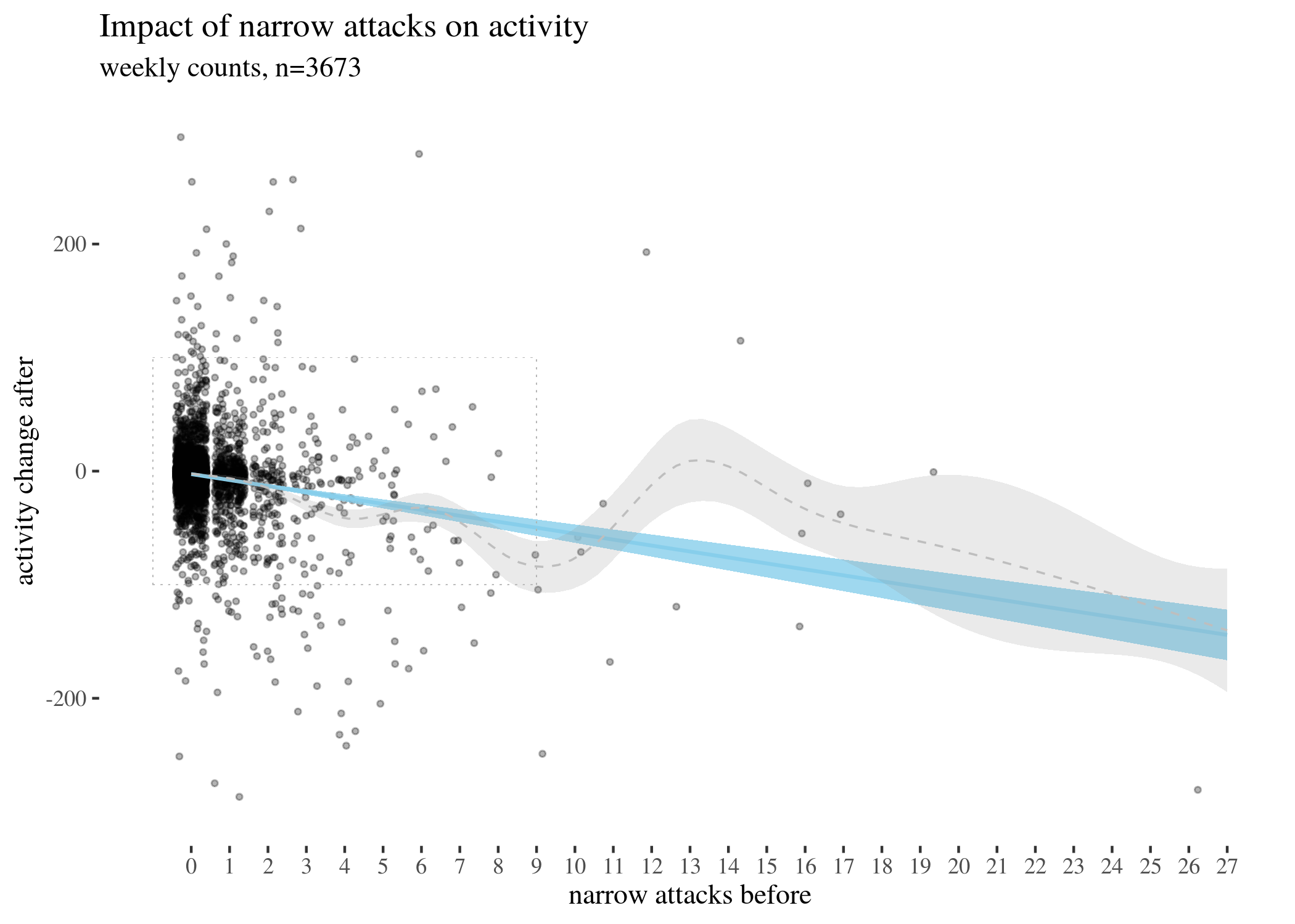
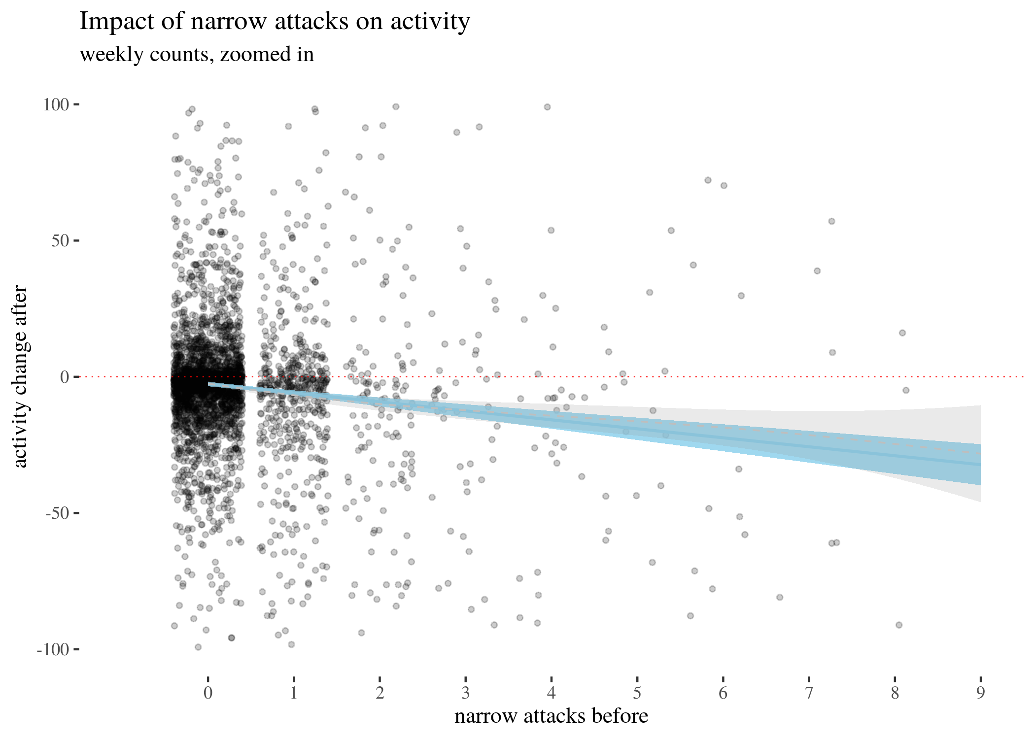
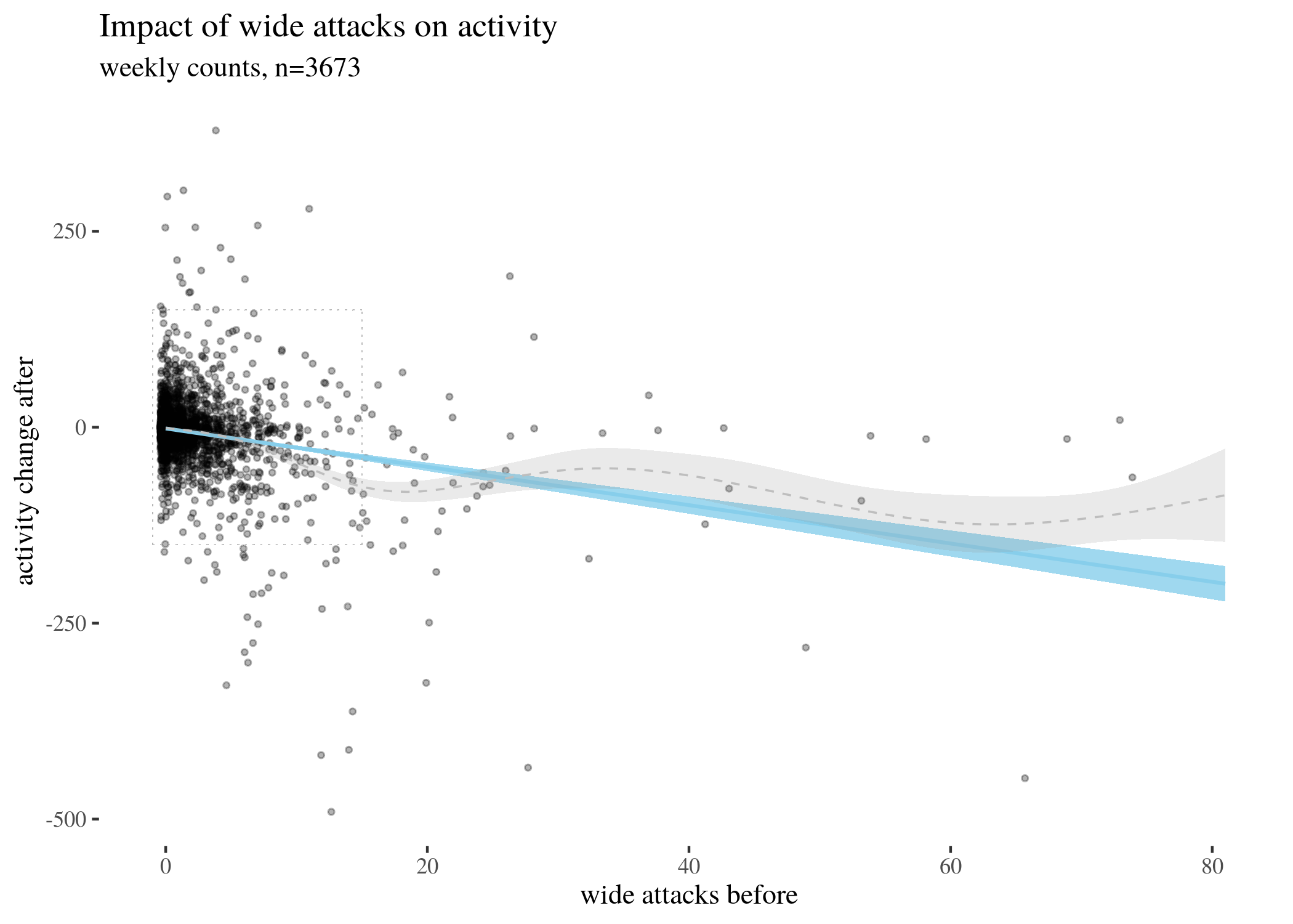
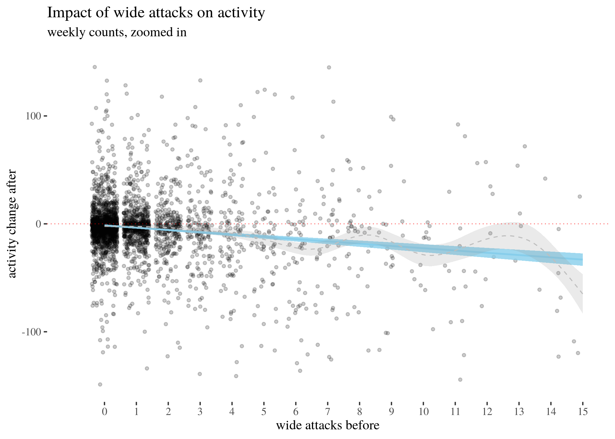
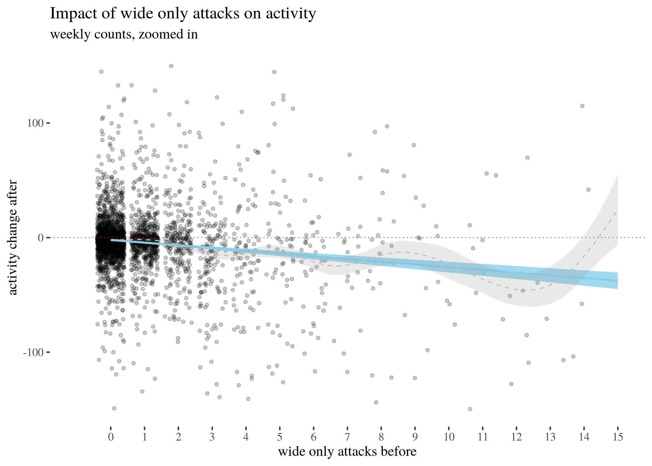
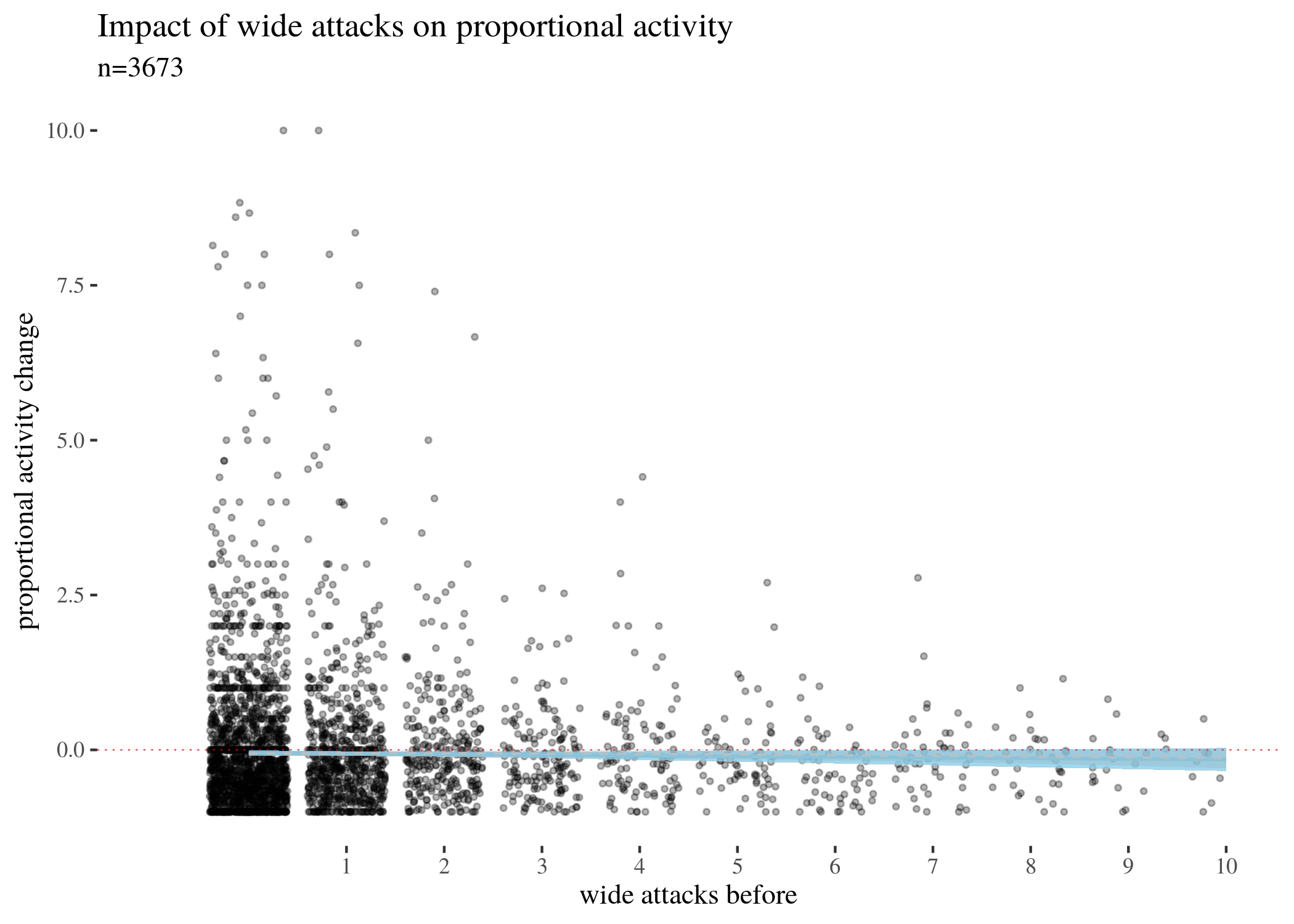
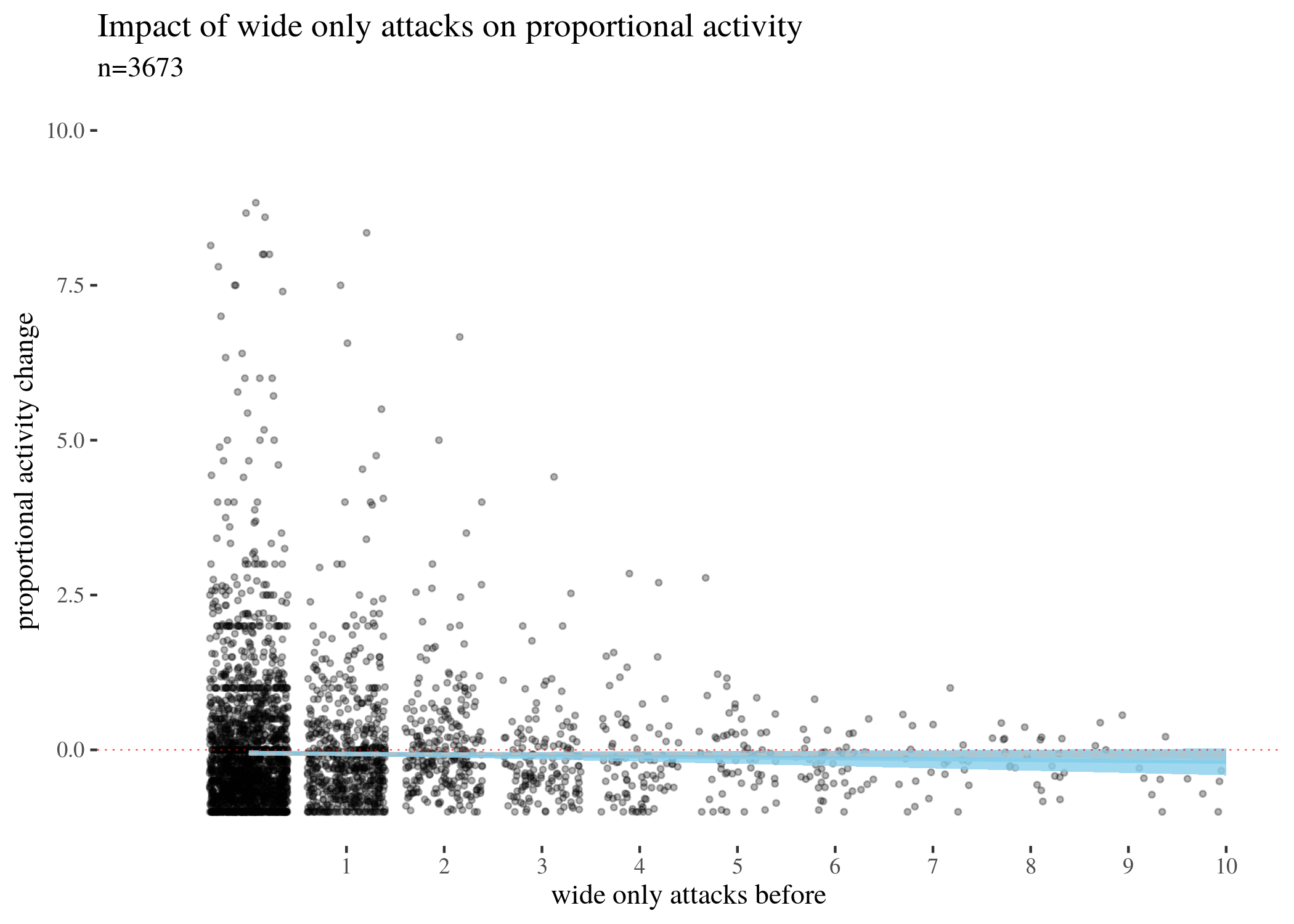
First, we visually explore our dataset by looking at the relationship between the number of received attacks vs. the activity change counted as the difference of weekly counts of posts or comments authored in the second (after) and in the first week (before). We do this for narrow attacks , wide attacks, where a weaker, but still negative impact, can be observed, and then we take a look at the impact of those attacks which were recognized as wide only. The distinction between wide and narrow pertains only to the choice of attack recognition algorithm and does not directly translate into how offensive an attack was, except that wide attacks also include third-person ones. Here, the direction of impact is less clear: while the tendency is negative for low numbers of attacks, non-linear smoothing suggests that higher numbers mostly third-person personal attacks seem positively correlated with activity change. This might suggest that while being attacked has negative impact on a user’s activity, having your post “supported” by other users’ third-person attacks has a more motivating effect. We will look at this issue in a later section, when we analyze the dataset using regression.
The visualisations should be understood as follows. Each point is a user. The $x$-axis represents a number of attacks they received in the before period (so that, for instance, users with 0 wide attacks are the members of the control group), and the $y$-axis represents the difference between their activity count before and after. We can see that most of the users received 0 attacks before (these are our control group members), with the rest of the group receiving 1, 2, 3, etc. attacks in the before period with decreasing frequency. The blue line represents linear regression suggesting negative correlation. The gray line is constructed using generalized additive mode (gam) smoothing, which is a fairly standard smoothing method for large datasets (it is more sensitive to local tendencies and yet avoids overfitting). The parameters of the gam model (including the level of smoothing) are chosen by their predictive accuracy. (See the documentation of gam of the mgcv package for details.) Shades indicate the $95\%$ confidence level interval for predictions from the linear model.
library(ggthemes)
th <- theme_tufte()
highPlot <- ggplot(data, aes(x = sumHighBefore, y = activityDiff)) +
geom_jitter(size = 0.8, alpha = 0.3) + geom_smooth(method = "lm",
color = "skyblue", fill = "skyblue", size = 0.7, alpha = 0.8) +
scale_x_continuous(breaks = 0:max(data$sumHighBefore), limits = c(-1,
max(data$sumHighBefore))) + ylim(c(-300, 300)) + geom_smooth(color = "grey",
size = 0.4, lty = 2, alpha = 0.2) + xlab("narrow attacks before") +
ylab("activity change after") + labs(title = "Impact of narrow attacks on activity",
subtitle = "weekly counts, n=3673") + geom_segment(aes(x = -1,
y = -100, xend = 9, yend = -100), lty = 3, size = 0.1, color = "gray71",
alpha = 0.2) + geom_segment(aes(x = -1, y = 100, xend = 9,
yend = 100), lty = 3, size = 0.1, color = "gray71", alpha = 0.2) +
geom_segment(aes(x = -1, y = -100, xend = -1, yend = 100),
lty = 3, size = 0.1, color = "gray71", alpha = 0.2) +
geom_segment(aes(x = 9, y = -100, xend = 9, yend = 100),
lty = 3, size = 0.1, color = "gray71", alpha = 0.2) +
th


highPlotZoomed <- ggplot(data, aes(x = sumHighBefore, y = activityDiff)) +
geom_jitter(size = 1, alpha = 0.2) + geom_smooth(method = "lm",
color = "skyblue", fill = "skyblue", size = 0.7, alpha = 0.8) +
th + scale_x_continuous(breaks = 0:max(data$sumHighBefore),
limits = c(-1, 9)) + ylim(c(-100, 100)) + geom_smooth(color = "grey",
size = 0.4, lty = 2, alpha = 0.2) + xlab("narrow attacks before") +
ylab("activity change after") + labs(title = "Impact of narrow attacks on activity",
subtitle = "weekly counts, zoomed in") + geom_hline(yintercept = 0,
col = "red", size = 0.2, lty = 3)
highPlot
highPlotZoomed
lowPlot <- ggplot(data, aes(x = sumLowBefore, y = activityDiff)) +
geom_jitter(size = 0.8, alpha = 0.3) + geom_smooth(method = "lm",
color = "skyblue", fill = "skyblue", size = 0.7, alpha = 0.8) +
th + geom_smooth(color = "grey", size = 0.4, lty = 2, alpha = 0.2) +
xlab("wide attacks before") + ylab("activity change after") +
labs(title = "Impact of wide attacks on activity", subtitle = "weekly counts, n=3673") +
geom_segment(aes(x = -1, y = -150, xend = 15, yend = -150),
lty = 3, size = 0.1, color = "gray71", alpha = 0.2) +
geom_segment(aes(x = -1, y = 150, xend = 15, yend = 150),
lty = 3, size = 0.1, color = "gray71", alpha = 0.2) +
geom_segment(aes(x = -1, y = -150, xend = -1, yend = 150),
lty = 3, size = 0.1, color = "gray71", alpha = 0.2) +
geom_segment(aes(x = 15, y = -150, xend = 15, yend = 150),
lty = 3, size = 0.1, color = "gray71", alpha = 0.2) +
xlim(c(-1, max(data$sumLowBefore)))


lowPlotZoomed <- ggplot(data, aes(x = sumLowBefore, y = activityDiff)) +
geom_jitter(size = 1, alpha = 0.2) + geom_smooth(method = "lm",
color = "skyblue", fill = "skyblue", size = 0.7, alpha = 0.8) +
th + scale_x_continuous(breaks = 0:max(data$sumLowBefore),
limits = c(-1, 15)) + ylim(c(-150, 150)) + geom_smooth(color = "grey",
size = 0.4, lty = 2, alpha = 0.2) + xlab("wide attacks before") +
ylab("activity change after") + labs(title = "Impact of wide attacks on activity",
subtitle = "weekly counts, zoomed in") + geom_hline(yintercept = 0,
col = "red", size = 0.2, lty = 3)
lowPlot
lowPlotZoomed
lowOnlyPlot <- ggplot(data, aes(x = (sumLowBefore - sumHighBefore),
y = activityDiff)) + geom_jitter(size = 0.8, alpha = 0.3) +
geom_smooth(method = "lm", color = "skyblue", fill = "skyblue",
size = 0.7, alpha = 0.8) + th + geom_smooth(color = "grey",
size = 0.4, lty = 2, alpha = 0.2) + xlab("wide only attacks before") +
ylab("activity change after") + labs(title = "Impact of wide only attacks on activity",
subtitle = "weekly counts, n=3673") + geom_segment(aes(x = -1,
y = -150, xend = 15, yend = -150), lty = 3, size = 0.1, color = "gray71",
alpha = 0.2) + geom_segment(aes(x = -1, y = 150, xend = 15,
yend = 150), lty = 3, size = 0.1, color = "gray71", alpha = 0.2) +
geom_segment(aes(x = -1, y = -150, xend = -1, yend = 150),
lty = 3, size = 0.1, color = "gray71", alpha = 0.2) +
geom_segment(aes(x = 15, y = -150, xend = 15, yend = 150),
lty = 3, size = 0.1, color = "gray71", alpha = 0.2) +
xlim(c(-1, max(data$sumLowBefore)))


lowOnlyPlotZoomed <- ggplot(data, aes(x = (sumLowBefore - sumHighBefore),
y = activityDiff)) + geom_jitter(size = 1, alpha = 0.2) +
geom_smooth(method = "lm", color = "skyblue", fill = "skyblue",
size = 0.7, alpha = 0.8) + th + scale_x_continuous(breaks = 0:max(data$sumLowBefore),
limits = c(-1, 15)) + ylim(c(-150, 150)) + geom_smooth(color = "grey",
size = 0.4, lty = 2, alpha = 0.2) + xlab("wide only attacks before") +
ylab("activity change after") + labs(title = "Impact of wide only attacks on activity",
subtitle = "weekly counts, zoomed in") + geom_hline(yintercept = 0,
col = "red", size = 0.2, lty = 3)
lowOnlyPlot
lowOnlyPlotZoomed
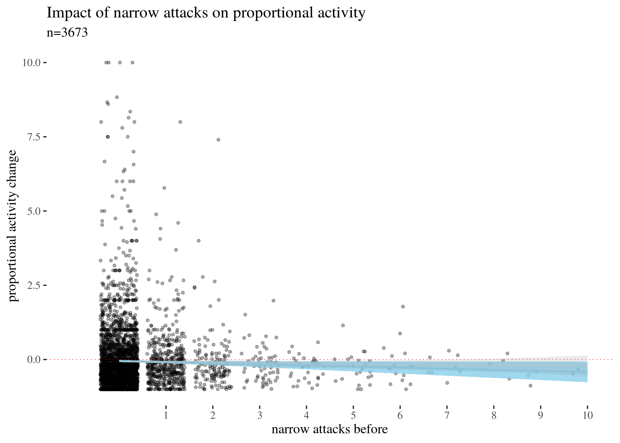
The above visualises the activity change in terms of weekly counts. However, arguably, a change of -20 for a user who posts 500 times a week has different weight than for a user who posts 30 times. For this reason, we also need to look at changes in proportion, calculated by the following formula:
\begin{align} \mathsf{activityScore} = & \frac{\mathsf{activityDifference}}{\mathsf{activityBefore}} \end{align}
We zoom in to densely populated areas of the plot for activityScore as a function of the three types of attacks. The impact is still negative, more so for narrow attacks, and less so for other types. Note that for mathematical reasons the score minimum is -1 (user activity cannot drop more than 100\%), and so the graph looks assymetric around the horizontal line.
rescale <- function(diff, act) {
diff/act
}
data$activityScore <- rescale(data$activityDiff, data$activityBefore)

propPlotHigh <- ggplot(data, aes(x = sumHighBefore, y = activityScore)) +
geom_jitter(size = 0.8, alpha = 0.3) + geom_smooth(method = "lm",
color = "skyblue", fill = "skyblue", size = 0.7, alpha = 0.8) +
th + xlab("narrow attacks before") + ylab("proportional activity change") +
labs(title = "Impact of narrow attacks on proportional activity",
subtitle = "n=3673") + scale_y_continuous(limits = c(-1,
10)) + geom_hline(yintercept = 0, col = "red", size = 0.2,
lty = 3) + scale_x_continuous(breaks = 1:15, limits = c(-1,
10)) + geom_smooth(color = "grey", size = 0.4, lty = 2, alpha = 0.2)

propPlotLow <- ggplot(data, aes(x = sumLowBefore, y = activityScore)) +
geom_jitter(size = 0.8, alpha = 0.3) + geom_smooth(method = "lm",
color = "skyblue", fill = "skyblue", size = 0.7, alpha = 0.8) +
th + xlab("wide attacks before") + ylab("proportional activity change") +
labs(title = "Impact of wide attacks on proportional activity",
subtitle = "n=3673") + scale_y_continuous(limits = c(-1,
10)) + geom_hline(yintercept = 0, col = "red", size = 0.2,
lty = 3) + scale_x_continuous(breaks = 1:15, limits = c(-1,
10)) + geom_smooth(color = "grey", size = 0.4, lty = 2, alpha = 0.2)


propPlotLowOnly <- ggplot(data, aes(x = sumLowBefore - sumHighBefore,
y = activityScore)) + geom_jitter(size = 0.8, alpha = 0.3) +
geom_smooth(method = "lm", color = "skyblue", fill = "skyblue",
size = 0.7, alpha = 0.8) + th + xlab("wide only attacks before") +
ylab("proportional activity change") + labs(title = "Impact of wide only attacks on proportional activity",
subtitle = "n=3673") + scale_y_continuous(limits = c(-1,
10)) + geom_hline(yintercept = 0, col = "red", size = 0.2,
lty = 3) + scale_x_continuous(breaks = 1:15, limits = c(-1,
10)) + geom_smooth(color = "grey", size = 0.4, lty = 2, alpha = 0.2)
propPlotHigh
propPlotLow
propPlotLowOnly
Classical estimation
Next, we focus on the uncertainties involved. One standard way to estimate them is to use a one-sample t-tests to estimate the means and $95\%$ confidence intervals for activityDifference for different numbers of attacks (this would be equivalent to running a paired t-test for activity before and activity after).
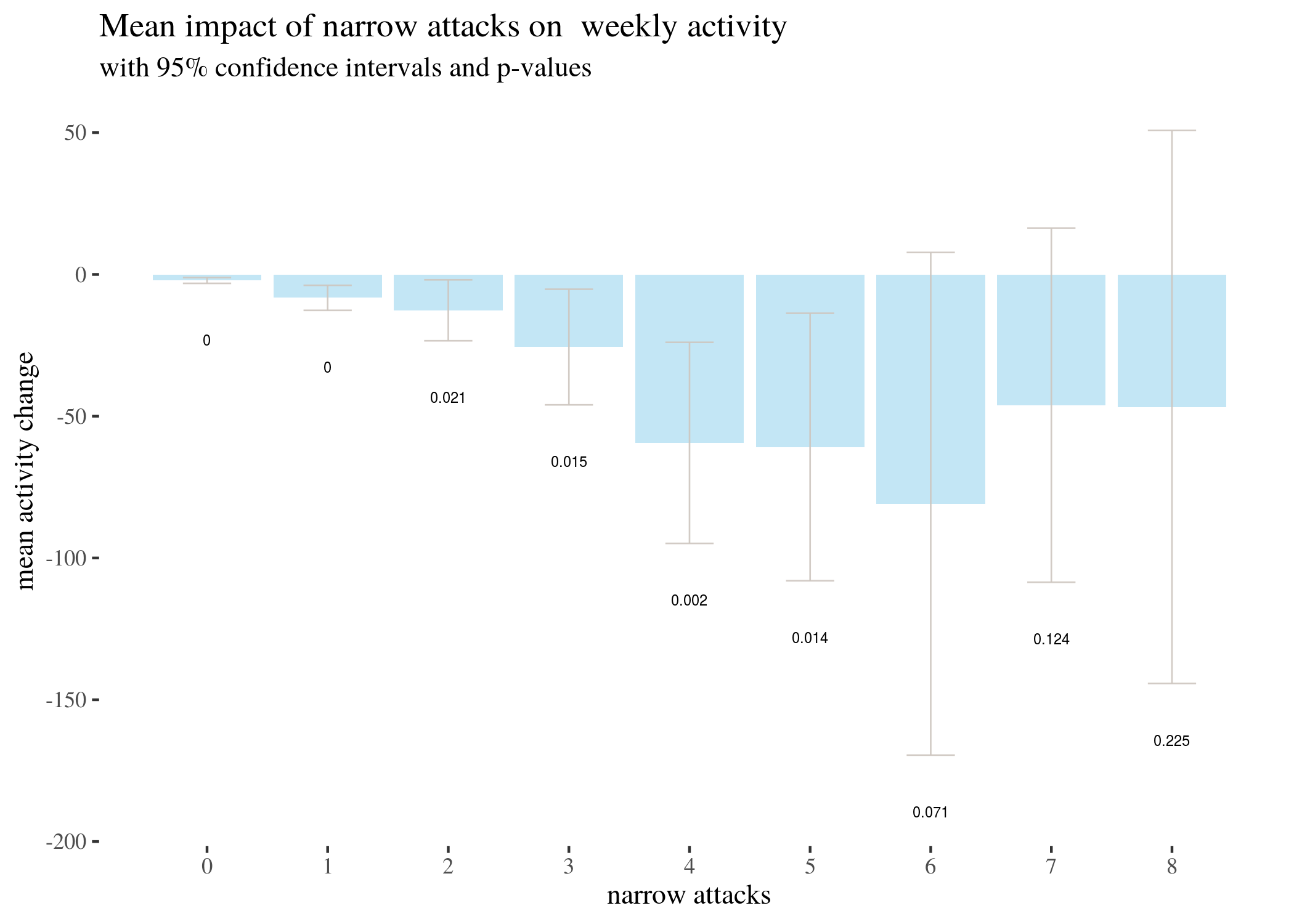
Here is the analysis for narrow attacks. There were not enough observations for attacks above 8 (3, 2, and 2 for 9, 10 and 11 attacks, and single observations for a few higher non-zero counts) for a t-test to be useful, so we run the t-test for up to 8 attacks.
counts <- t(table(data$sumHighBefore))
counts <- rbind(counts, counts)
counts[1, ] <- as.numeric(colnames(counts))
colnames(counts) <- NULL
rownames(counts) <- c("no. of attacks", "count")
counts
##                [,1] [,2] [,3] [,4] [,5] [,6] [,7] [,8] [,9] [,10] [,11] [,12]
## no. of attacks    0    1    2    3    4    5    6    7    8     9    10    11
## count          2831  530  147   61   35   22   17    8    4     3     2     2
##                [,13] [,14] [,15] [,16] [,17] [,18] [,19] [,20] [,21]
## no. of attacks    12    13    14    16    17    19    25    26    27
## count              1     1     1     3     1     1     1     1     1
We proceed as follows. We list 9 options of the number of attacks and initiate vectors to which we will save the confidence interval limits (low, high), the estimated mean and the $p$-value. We use the same approach to analyze the other types of attacks.
attacks <- 0:8
max <- max(attacks)
low <- numeric(max + 1)
high <- numeric(max + 1)
m <- numeric(max + 1)
p <- numeric(max + 1)
t <- list()
for (attacks in attacks) {
t[[attacks + 1]] <- t.test(data[data$sumHighBefore == attacks,]$activityDiff)
  low[attacks + 1] <- t[[attacks + 1]]$conf.int[1]
  high[attacks + 1] <- t[[attacks + 1]]$conf.int[2]
  m[attacks + 1] <- t[[attacks + 1]]$estimate
  p[attacks + 1] <- t[[attacks + 1]]$p.value
  }
highTable <- as.data.frame(round(rbind(0:8, low, m, high, p),3))
rownames(highTable) <- c("attacks", "CIlow", "estimated m", "CIhigh",
"p-value")
highTableLong <- round(data.frame(attacks = 0:8, low, m, high,p), 3)
highTableBar <- ggplot(highTableLong) + geom_bar(aes(x = attacks,
y = m), stat = "identity", fill = "skyblue", alpha = 0.5) +
geom_errorbar(aes(x = attacks, ymin = low, ymax = high),
width = 0.4, colour = "seashell3", alpha = 0.9, size = 0.3) +
th + xlab("narrow attacks") + ylab("mean activity change") +
geom_text(aes(x = attacks, y = low - 20, label = p), size = 2) +
labs(title = "Mean impact of narrow attacks on weekly activity",
subtitle = "with 95% confidence intervals and p-values") +
scale_x_continuous(labels = 0:8, breaks = 0:8)
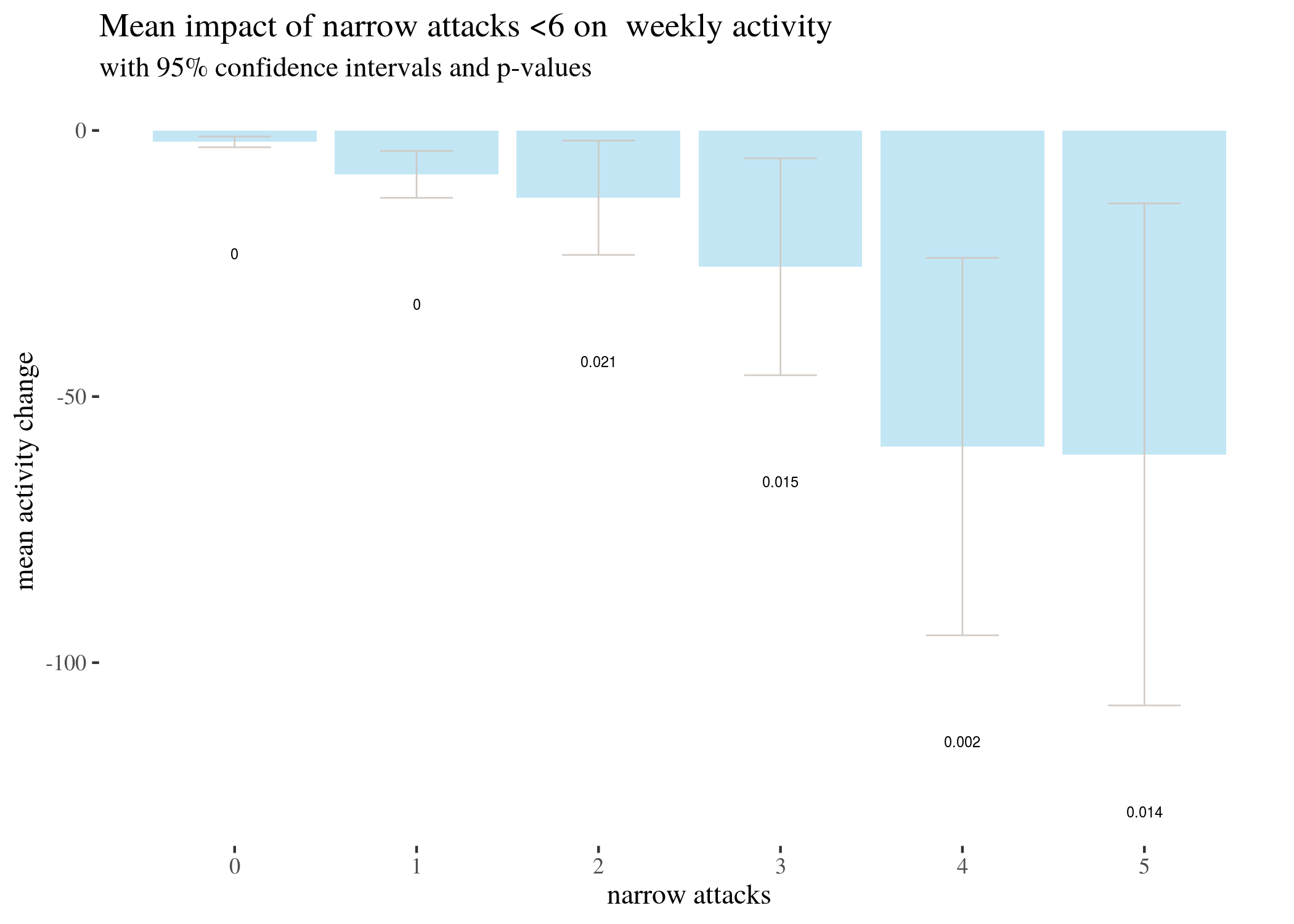
highTableBar6 <- ggplot(highTableLong[highTableLong$attacks <
6, ]) + geom_bar(aes(x = attacks, y = m), stat = "identity",
fill = "skyblue", alpha = 0.5) + geom_errorbar(aes(x = attacks,
ymin = low, ymax = high), width = 0.4, colour = "seashell3",
alpha = 0.9, size = 0.3) + th + xlab("narrow attacks") +
ylab("mean activity change") + geom_text(aes(x = attacks,
y = low - 20, label = p), size = 2) + labs(title = "Mean impact of narrow attacks <6 on weekly activity",
subtitle = "with 95% confidence intervals and p-values") +
scale_x_continuous(labels = 0:5, breaks = 0:5)
highTableBar3 <- ggplot(highTableLong[highTableLong$attacks <
3, ]) + geom_bar(aes(x = attacks, y = m), stat = "identity",
fill = "skyblue", alpha = 0.5) + geom_errorbar(aes(x = attacks,
ymin = low, ymax = high), width = 0.4, colour = "seashell3",
alpha = 0.9, size = 0.3) + th + xlab("narrow attacks") +
lab("mean activity change") + geom_text(aes(x = attacks,
y = low - 5, label = p), size = 2) + labs(title = "Mean impact of narrow attacks <3 on weekly activity",
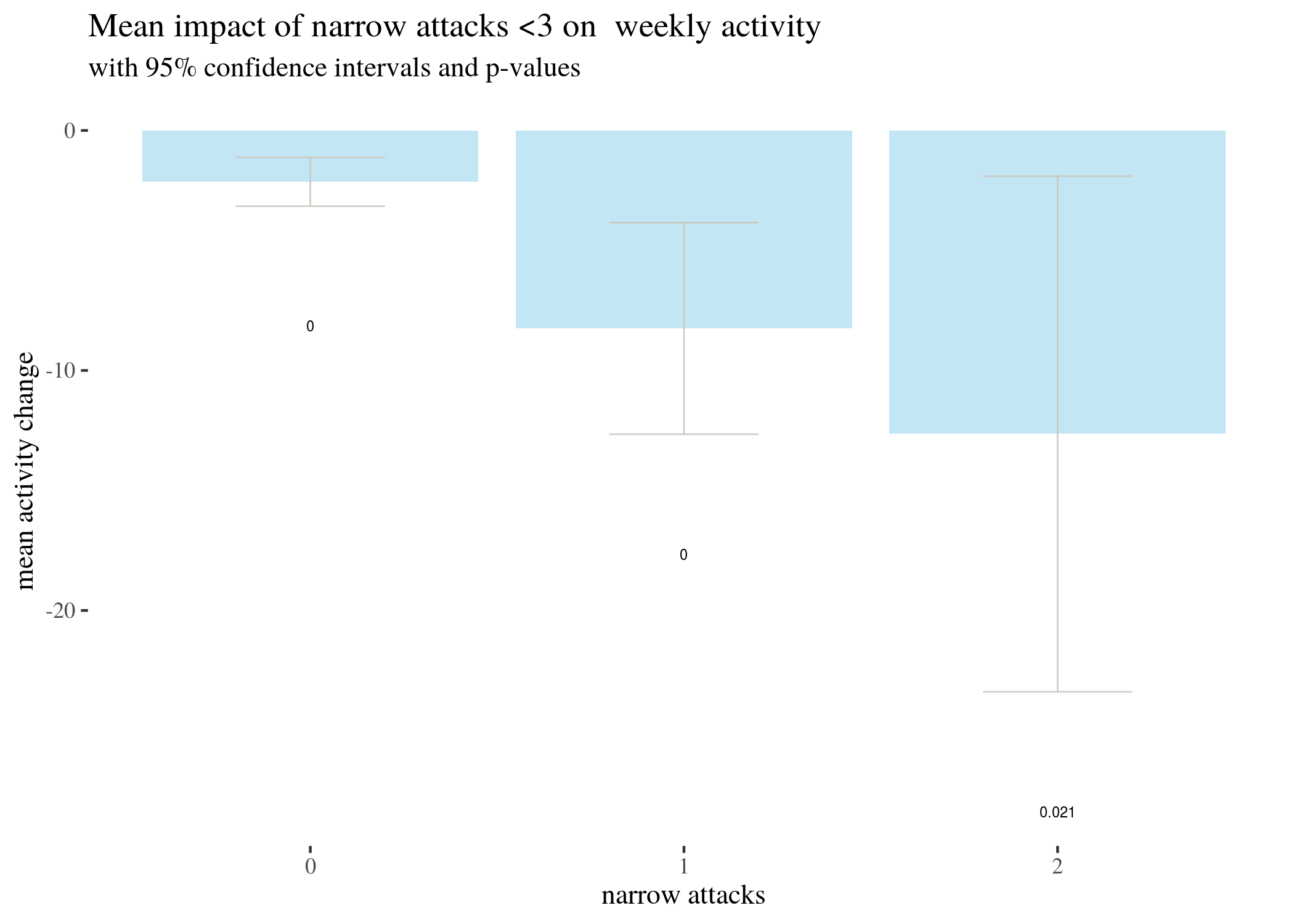
subtitle = "with 95% confidence intervals and p-values") +
scale_x_continuous(labels = 0:2, breaks = 0:2)
attacks <- 0:8
max <- max(attacks)
lowL <- numeric(max + 1)
highL <- numeric(max + 1)
mL <- numeric(max + 1)
pL <- numeric(max + 1)
tL <- list()

for (attacks in attacks) {
  tL[[attacks + 1]] <- t.test(data[data$sumLowBefore == attacks,]$activityDiff)

  lowL[attacks + 1] <- t[[attacks + 1]]$conf.int[1]
  highL[attacks + 1] <- t[[attacks + 1]]$conf.int[2]
  mL[attacks + 1] <- t[[attacks + 1]]$estimate
  pL[attacks + 1] <- t[[attacks + 1]]$p.value
  }
lowTable <- as.data.frame(round(rbind(0:8, lowL, mL, highL, pL),3))
ownames(lowTable) <- c("attacks", "CIlow", "estimated m", "CIhigh","p-value")

attacks <- 0:8
max <- max(attacks)
lowLo <- numeric(max + 1)
highLo <- numeric(max + 1)
mLo <- numeric(max + 1)
pLo <- numeric(max + 1)
tLo <- list()

for (attacks in attacks) {
tLo[[attacks + 1]] <- t.test(data[data$sumLowBefore - data$sumHighBefore == attacks, ]$activityDiff)
lowLo[attacks + 1] <- t[[attacks + 1]]$conf.int[1]
highLo[attacks + 1] <- t[[attacks + 1]]$conf.int[2]
mLo[attacks + 1] <- t[[attacks + 1]]$estimate
pLo[attacks + 1] <- t[[attacks + 1]]$p.value
}

lowOnlyTable <- as.data.frame(round(rbind(0:8, lowLo, mLo, highLo, pLo), 3))
rownames(lowTable) <- c("attacks", "CIlow", "estimated m", "CIhigh",
"p-value")
lowTableLong <- round(data.frame(attacks = 0:8, lowL, mL, highL, pL), 3)
lowTableBar <- ggplot(lowTableLong) + geom_bar(aes(x = attacks, y = m),
stat = "identity", fill = "skyblue", alpha = 0.5) +
geom_errorbar(aes(x = attacks, ymin = low, ymax = high),
width = 0.4, colour = "seashell3", alpha = 0.9, size = 0.3) +
th + xlab("wide attacks") + ylab("mean activity change") +
geom_text(aes(x = attacks, y = low - 20, label = round(p,
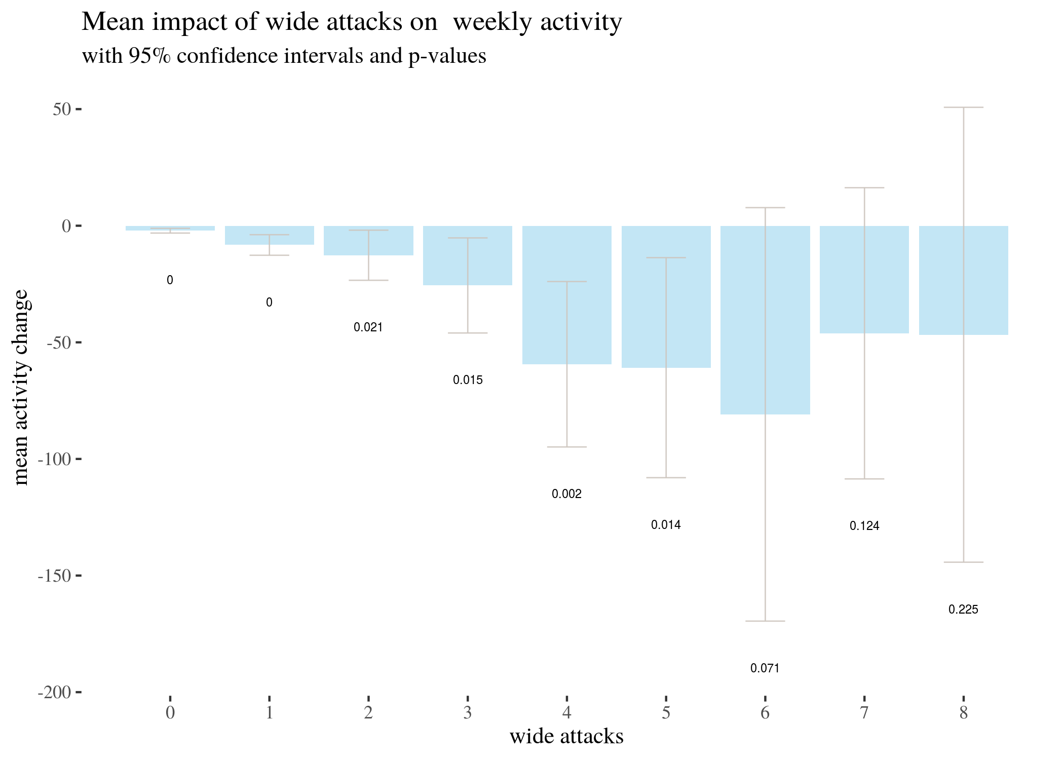
3)), size = 2) + labs(title = "Mean impact of wide attacks on weekly activity",
subtitle = "with 95% confidence intervals and p-values") +
scale_x_continuous(labels = 0:8, breaks = 0:8)
lowOnlyTableLong <- round(data.frame(attacks = 0:8, lowLo, mLo, highLo, pLo), 3)
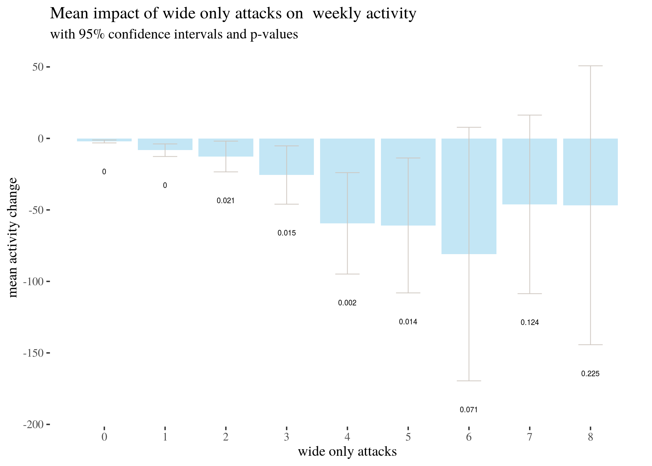
lowOnlyTableBar <- ggplot(lowOnlyTableLong) + geom_bar(aes(x = attacks,
y = m), stat = "identity", fill = "skyblue", alpha = 0.5) +
geom_errorbar(aes(x = attacks, ymin = low, ymax = high),
width = 0.4, colour = "seashell3", alpha = 0.9, size = 0.3) +
th + xlab("wide only attacks") + ylab("mean activity change") +
geom_text(aes(x = attacks, y = low - 20, label = round(p,
3)), size = 2) + labs(title = "Mean impact of wide only attacks on weekly activity",
subtitle = "with 95% confidence intervals and p-values") +
scale_x_continuous(labels = 0:8, breaks = 0:8)\
T-test based estimates for activity change divided by numbers of narrow attacks received:
##                 V1      V2      V3      V4      V5       V6       V7       V8
## attacks      0.000   1.000   2.000   3.000   4.000    5.000    6.000    7.000
## CIlow       -3.154 -12.658 -23.390 -45.991 -94.861 -108.030 -169.527 -108.555
## estimated m -2.140  -8.251 -12.646 -25.607 -59.400  -60.864  -80.882  -46.125
## CIhigh      -1.125  -3.844  -1.902  -5.222 -23.939  -13.697    7.762   16.305
## p-value      0.000   0.000   0.021   0.015   0.002    0.014    0.071    0.124
##                   V9
## attacks        8.000
## CIlow       -144.273
## estimated m  -46.750
## CIhigh        50.773
## p-value        0.225
T-test based estimates for activity change divided by numbers of wide attacks received:
##                 V1      V2      V3      V4      V5       V6       V7       V8
## attacks      0.000   1.000   2.000   3.000   4.000    5.000    6.000    7.000
## CIlow       -3.154 -12.658 -23.390 -45.991 -94.861 -108.030 -169.527 -108.555
## estimated m -2.140  -8.251 -12.646 -25.607 -59.400  -60.864  -80.882  -46.125
## CIhigh      -1.125  -3.844  -1.902  -5.222 -23.939  -13.697    7.762   16.305
## p-value      0.000   0.000   0.021   0.015   0.002    0.014    0.071    0.124
##                   V9
## attacks        8.000
## CIlow       -144.273
## estimated m  -46.750
## CIhigh        50.773
## p-value        0.225
T-test based estimates for activity change divided by numbers of wide only attacks received:
##            V1      V2      V3      V4      V5       V6       V7       V8
##         0.000   1.000   2.000   3.000   4.000    5.000    6.000    7.000
## lowLo  -3.154 -12.658 -23.390 -45.991 -94.861 -108.030 -169.527 -108.555
## mLo    -2.140  -8.251 -12.646 -25.607 -59.400  -60.864  -80.882  -46.125
## highLo -1.125  -3.844  -1.902  -5.222 -23.939  -13.697    7.762   16.305
## pLo     0.000   0.000   0.021   0.015   0.002    0.014    0.071    0.124
##              V9
##           8.000
## lowLo  -144.273
## mLo     -46.750
## highLo   50.773
## pLo       0.225
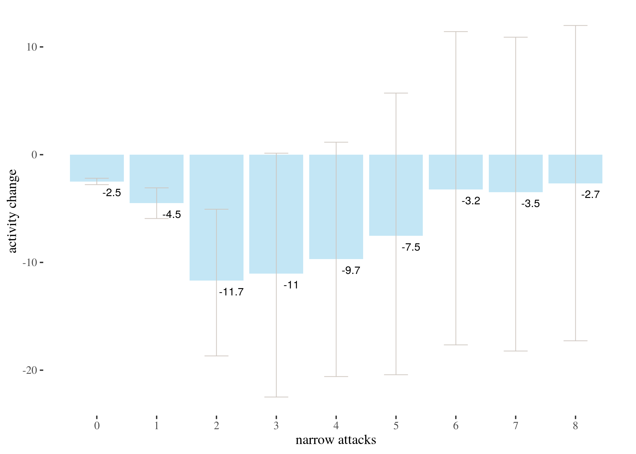
We represent this information in barplots. Two of them are restricted to different numbers of attacks for legibility. The printed values below bars represent $p$-values, not the estimated means.
highTableBar
highTableBar6
highTableBar3
lowTableBar
lowOnlyTableBar
Now, let’s take a look at power calculations for higher numbers of attacks.
h6 <- data[data$sumHighBefore == 6, ]
h7 <- data[data$sumHighBefore == 7, ]
h8 <- data[data$sumHighBefore == 8, ]

# power for 6 attacks
a <- mean(data$activityDiff)
s <- sd(h7$activityDiff)
n <- 8
error <- qt(0.975, df = n - 1) * s/sqrt(n)
left <- a - error
right <- a + error
assumed <- a - 80
tleft <- (left - assumed)/(s/sqrt(n))
tright <- (right - assumed)/(s/sqrt(n))
p <- pt(tright, df = n - 1) - pt(tleft, df = n - 1)
power6 <- 1 - p
power6
## [1] 0.7369795
# power for 7 attacks
a <- mean(data$activityDiff)
s <- sd(h7$activityDiff)
n <- 8
error <- qt(0.975, df = n - 1) * s/sqrt(n)
left <- a - error
right <- a + error
assumed <- a - 80
tleft <- (left - assumed)/(s/sqrt(n))
tright <- (right - assumed)/(s/sqrt(n))
p <- pt(tright, df = n - 1) - pt(tleft, df = n - 1)
power7 <- 1 - p
power7
## [1] 0.7369795
# power for 8 attacks
a <- mean(data$activityDiff)
s <- sd(h8$activityDiff)
n <- 4
error <- qt(0.975, df = n - 1) * s/sqrt(n)
left <- a - error
right <- a + error
assumed <- a - 80
tleft <- (left - assumed)/(s/sqrt(n))
tright <- (right - assumed)/(s/sqrt(n))
p <- pt(tright, df = n - 1) - pt(tleft, df = n - 1)
power8 <- 1 - p
power8
## [1] 0.3088534
Note fairly wide confidence intervals for higher number of attacks. These arise because attacks are quite rare, so the sample sizes for 5, 6, 7 and 8 narrow attacks are 22, 17, 8 and 4 respectively. This might be also the reason why $p$-values are not too low (although still below the usual significance thresholds). In fact, power analysis shows that if the real activity difference for those groups equals to the mean for narrow = 6, that is, -80, the probabilities that this effect would be discovered by a single sample t-test for 6, 7, and 8 attacks are 0.737, 0.737, 0.309, and so tests for higher numbers of attacks are underpowered.
We run single t-tests on different groups to estimate different means and we don’t use t-test for hypothesis testing. To alleviate concerns about multiple testing and increased risk of type I error, we also performed an ANOVA tests, which strongly suggest non-random correlation between the numbers of attacks and activity change. Furthermore, 80 comparison rows in Tukey’s Honest Significance Test (Tukey, 1949) have conservatively adjusted p-value below 0.05.
highAnova <- aov(activityDiff ~ as.factor(sumHighBefore), data = data)
lowAnova <- aov(activityDiff ~ as.factor(sumLowBefore), data = data)
lowOnlyAnova <- aov(activityDiff ~ as.factor(sumLowBefore - sumHighBefore),
    data = data)

library(descr, quietly = TRUE)
library(pander, quietly = TRUE)
library(papeR, quietly = TRUE)
sh <- xtable(summary(highAnova))
rownames(sh) <- c("narrow", "residuals")
sh
| Df | Sum Sq | Mean Sq | F value | Pr($>$F) | |
|---|---|---|---|---|---|
| narrow | 20 | 785495.95 | 39274.80 | 25.03 | 0.0000 |
| residuals | 3652 | 5730212.39 | 1569.06 |
sl <- xtable(summary(lowAnova))
rownames(sl) <- c("narrow", "residuals")
sl
| Df | Sum Sq | Mean Sq | F value | Pr($>$F) | |
|---|---|---|---|---|---|
| narrow | 42 | 1103365.53 | 26270.61 | 17.62 | 0.0000 |
| residuals | 3630 | 5412342.81 | 1491.00 |
so <- xtable(summary(lowOnlyAnova))
rownames(so) <- c("narrow", "residuals")
so
| Df | Sum Sq | Mean Sq | F value | Pr($>$F) | |
|---|---|---|---|---|---|
| narrow | 35 | 1106625.41 | 31617.87 | 21.26 | 0.0000 |
| residuals | 3637 | 5409082.93 | 1487.24 |
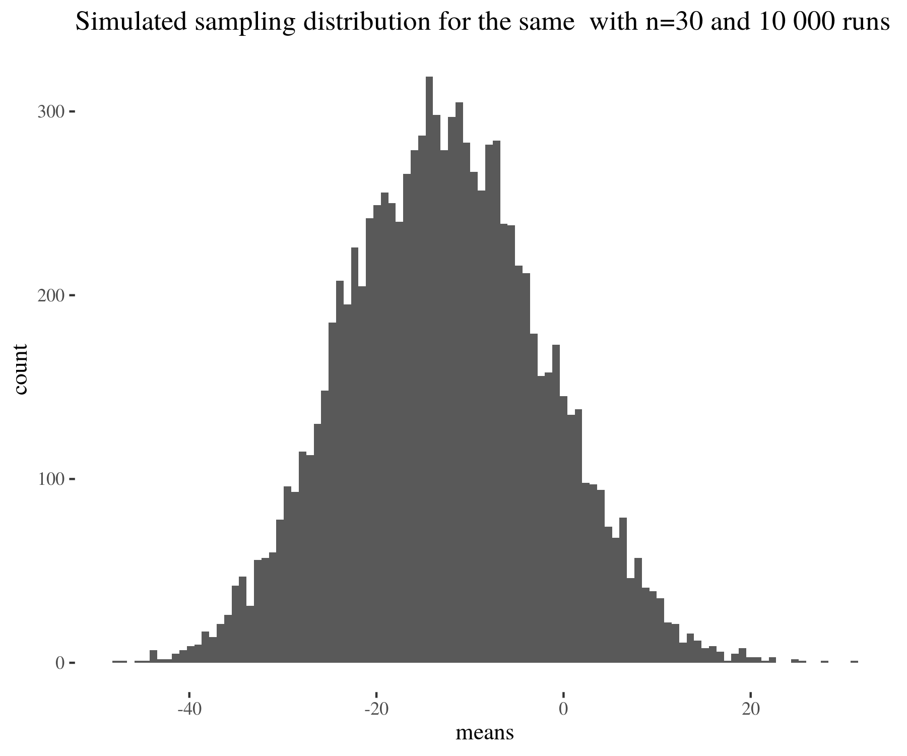
We used t-tests, which one might think assumes normality, to estimate means for distributions, which in fact are not normal. However, what t-test assumes is the normality of the sampling distribution, and this condition is much easier to satisfy thanks to the central limit theorem. See for instance the following figure:
means <- numeric(10000)
for (run in 1:10000) {
    means[run] <- mean(sample(data[data$sumHighBefore == 2, ]$activityDiff,
        30))
}
distr <- ggplot(data[data$sumHighBefore == 2, ], aes(x = activityDiff)) +
    geom_histogram(bins = 100) + th + ggtitle("Distribution of activityDiff for narrow attacks before = 2")


sampDistr <- ggplot() + geom_histogram(aes(x = means), bins = 100) +
    th + ggtitle("Simulated sampling distribution for the same  with n=30 and 10 000 runs")
distr
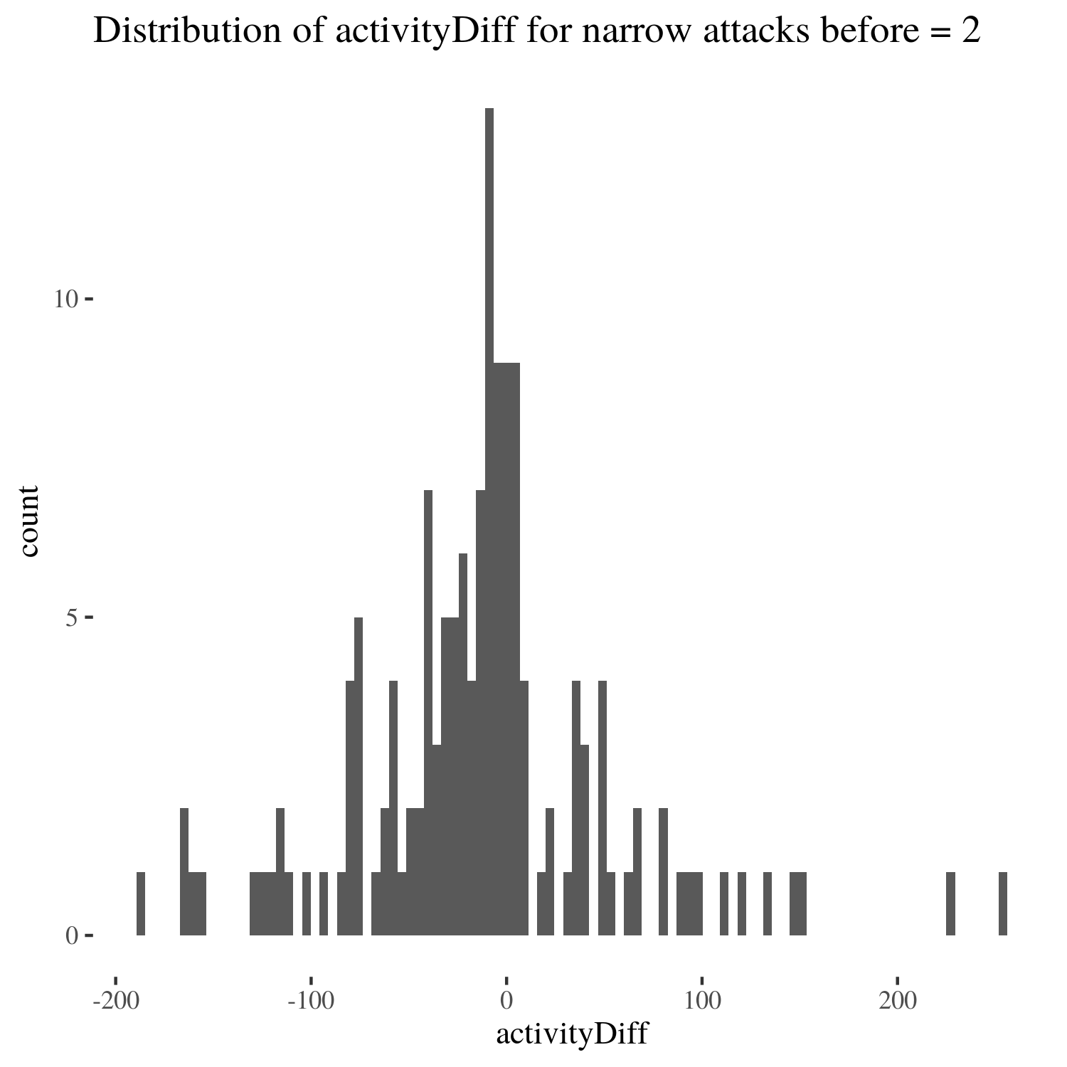
sampDistr
There are, however, some reasons to be concerned with classical methods:
-
$p$-values and confidence intervals are hard to interpret intuitively. For instance, a $95\%$ confidence interval being $(x,y)$ does not mean that the true mean is within $(x,y)$ with probability $0.95$, and the estimated mean being $z$ with $p$-value $0.01$ does not mean that the true population mean is $z$ with probability $0.99$.
-
p-values and confidence intervals are sensitive to undesirable factors, such as stopping intention in experiment design (Kruschke, 2015).
-
Classical hypothesis tests require several assumptions to hold which sometimes do not hold in reality, and the choice of significance thresholds is arbitrary.
-
Crucially, probabilities reported in classical analysis are probabilities of the data on the assumption of the null hypothesis (e.g., that the true mean is 0), not the posterior probabilities of the true parameter values given the data. To obtain these, we used Bayesian analysis and studied the impact of skeptical prior probabilities on how the data impacts the posterior distribution of the parameters at hand.
Bayesian estimation
We used Markov Chain Monte Carlo methods (using the Bayesian Estimation Supersedes the t-Test package) to estimate the posterior probability distribution for mean changes in activity
in different groups. Note you have to have JAGS installed on your computer to run the simulations, and be aware that
some of the computations are pretty demanding and will take time.
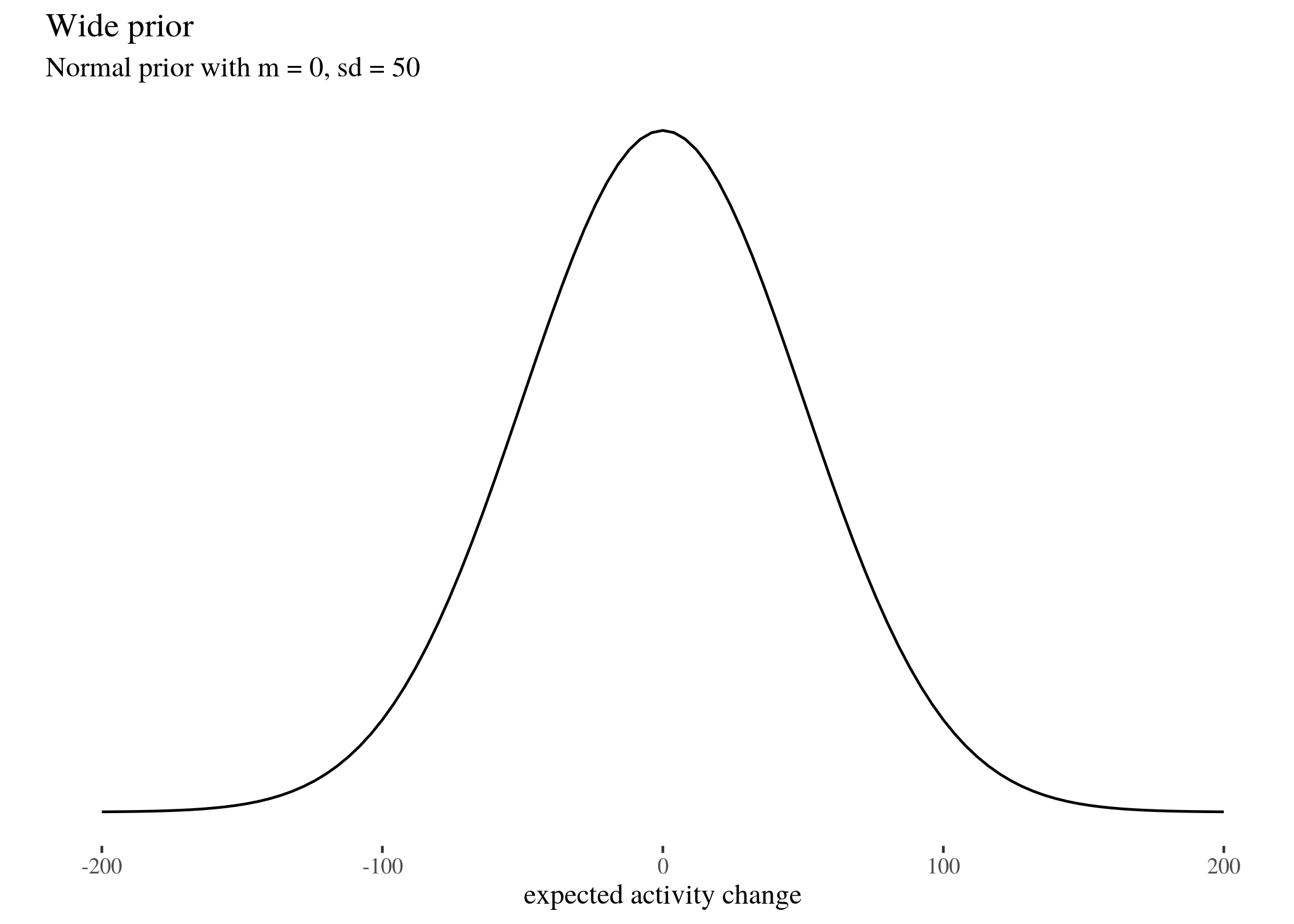
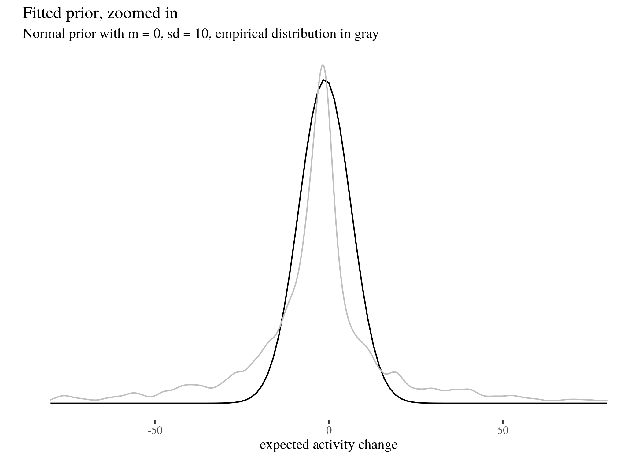
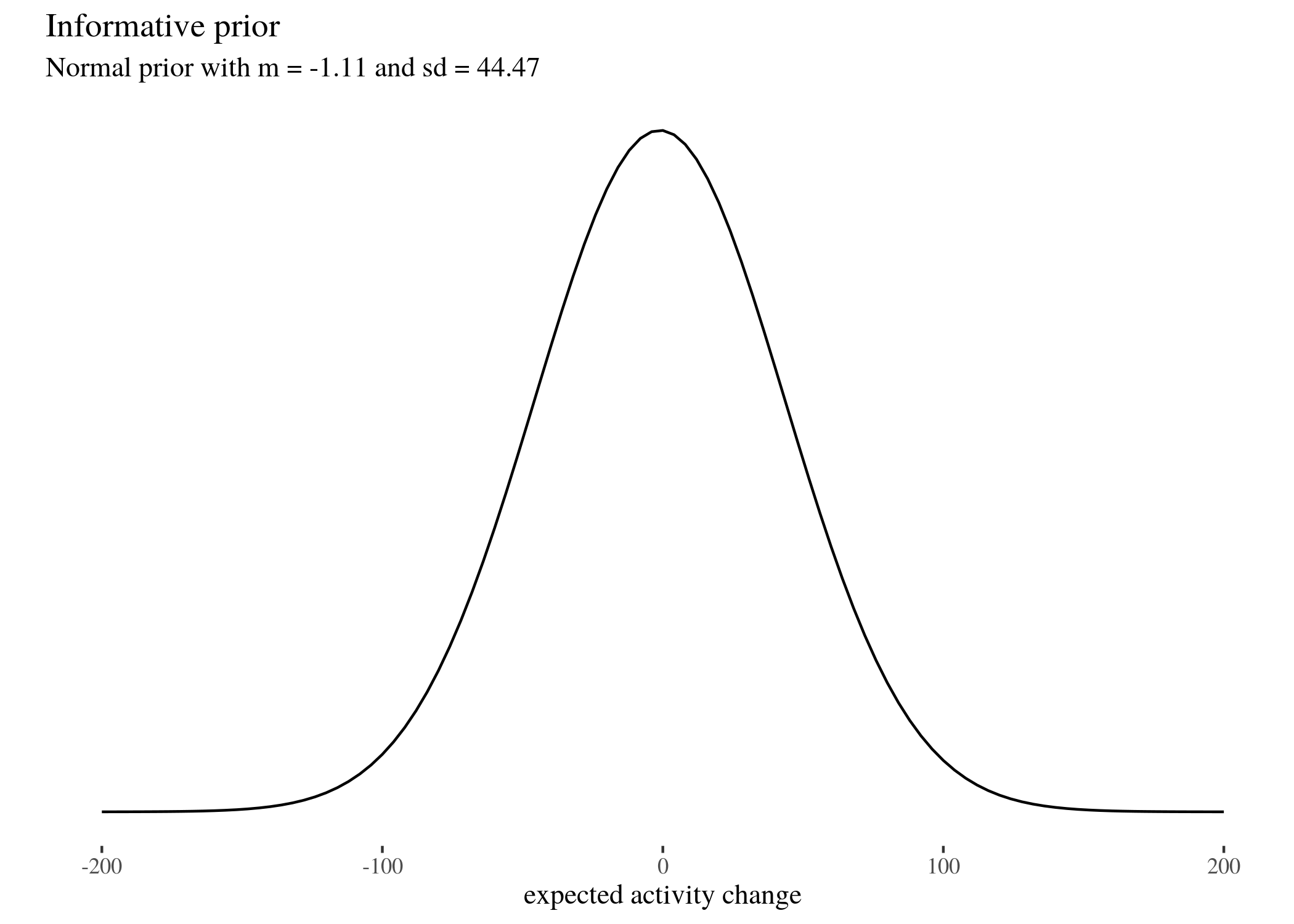
We did this for three different fairly skeptical normal prior distributions (which we call
wide, informed, and fit), whose means and standard deviations are respectively $(0,50), (-1.11,44.47)$ and $(-1.11,7.5)$ (read on for an explanation why).
library(BEST)
priorsWide <- list(muM = 0, muSD = 50)
priorsInformed <- list(muM = -1.11, muSD = 44.47)
priorsFit <- list(muM = -1.11, muSD = 7.5)
These are all normal distributions with different parameters. We follow the usual practice of presenting a Bayesian analysis with a range of options: the reader is to judge with prior seems most plausible to them, and then modify their beliefs according to the impact the data has on their prior convictions. The wide prior assumes that the most likely difference is 0, but the standard deviation is quite large, the informed prior takes the mean and standard deviation of the whole study group, whereas the fit prior follows fairly closely the actual empirical distribution of activity change values. All of them are fairly skeptical because they expect the change to be the same for every user, and they expect this change to be near 0. We did not use a completely uninformed uniform prior, because it is not sufficiently skeptical, being more easily impacted by the data, and because it has some undesirable mathematical properties. See Don’t Use Uniform Priors. They statistically don’t make sense for an accessible explanation. Our priors look as follows (note that the fitted prior looks similar when the $x$ scale is different to make the fitting more clearly visible; we also visualise the fitted prior in the same scale as the other priors). Here’s the visualisation code for the wide priors, code for the other priors is analogous.
priorWide <- ggplot(data = data.frame(x = c(-200, 200)), aes(x)) +
    stat_function(fun = dnorm, args = list(mean = 0, sd = 50)) +
    ylab("") + scale_y_continuous(breaks = NULL) + th + xlab("expected activity change") +
    labs(title = "Wide prior", subtitle = "Normal prior with m = 0, sd = 50")
priorWide
priorFit <- ggplot(data = data.frame(x = c(-100, 100)), aes(x)) +
stat_function(fun = dnorm, args = list(mean = -1.11, sd = 7.5)) +
ylab("") + scale_y_continuous(breaks = NULL) + th + xlab("expected activity change") +
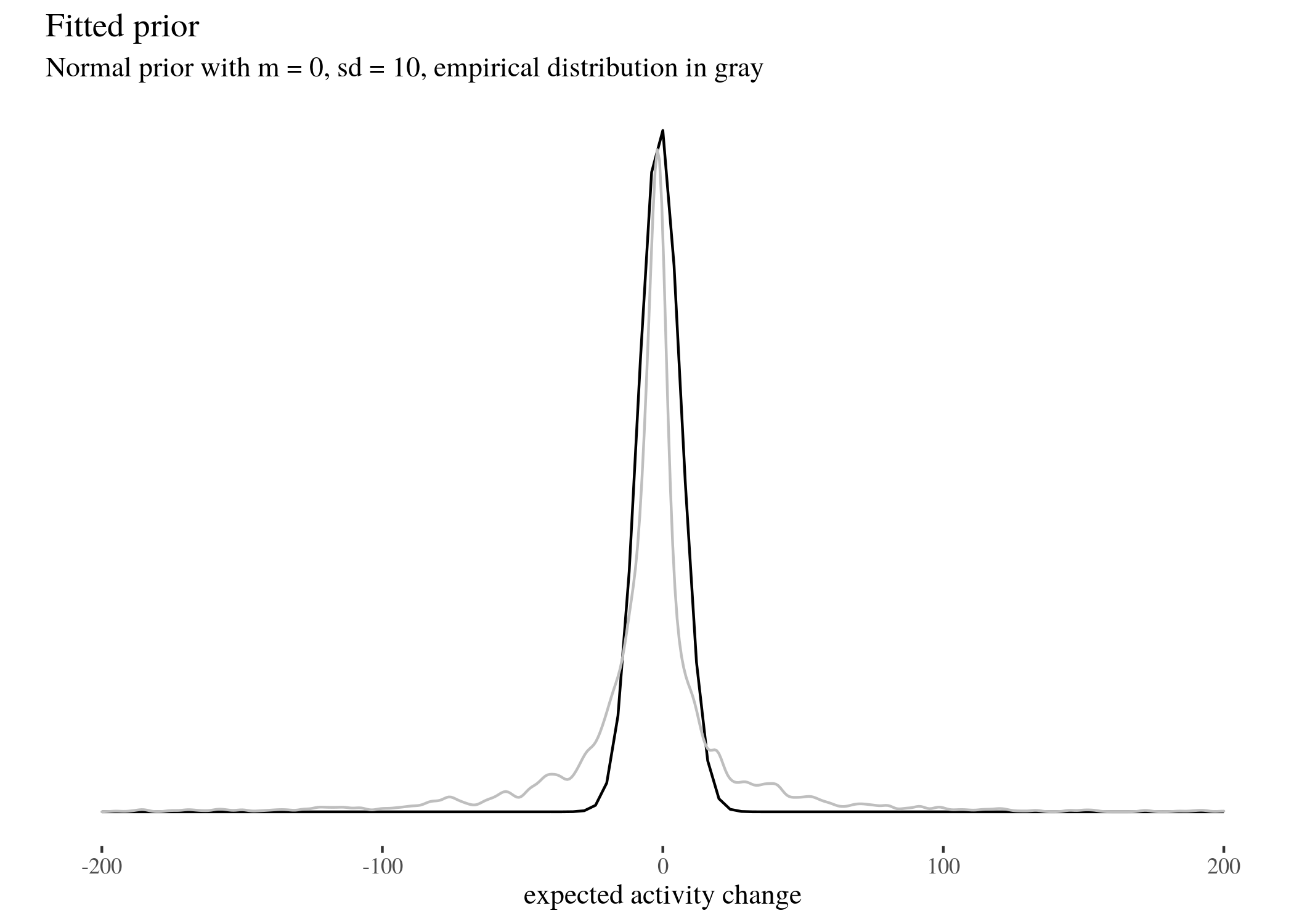
labs(title = "Fitted prior, zoomed in", subtitle = "Normal prior with m = 0, sd = 10, empirical distribution in gray") +
geom_density(data = data, aes(x = activityDiff), col = "grey",
alpha = 0.6) + xlim(c(-80, 80))
priorFit
priorInformative <- ggplot(data = data.frame(x = c(-200, 200)),
    aes(x)) + stat_function(fun = dnorm, args = list(mean = -1.11,
    sd = 44.47)) + ylab("") + scale_y_continuous(breaks = NULL) +
    th + xlab("expected activity change") + labs(title = "Informative prior",
    subtitle = "Normal prior with m = -1.11 and sd = 44.47")
priorInformative
priorFitted <- ggplot(data = data.frame(x = c(-100, 100)), aes(x)) +
    stat_function(fun = dnorm, args = list(mean = -1.11, sd = 7.5)) +
    ylab("") + scale_y_continuous(breaks = NULL) + th + xlab("expected activity change") +
    labs(title = "Fitted prior", subtitle = "Normal prior with m = 0, sd = 10, empirical distribution in gray") +
    geom_density(data = data, aes(x = activityDiff), col = "grey",
        alpha = 0.6) + xlim(c(-200, 200))
priorFitted
First, it will be convenient to split and extract the data (we will do the Bayesian analysis for narrow attacks:
sh0 <- data[data$sumHighBefore == 0, ]$activityDiff
sh1 <- data[data$sumHighBefore == 1, ]$activityDiff
sh2 <- data[data$sumHighBefore == 2, ]$activityDiff
sh3 <- data[data$sumHighBefore == 3, ]$activityDiff
sh4 <- data[data$sumHighBefore == 4, ]$activityDiff
sh5 <- data[data$sumHighBefore == 5, ]$activityDiff
sh6 <- data[data$sumHighBefore == 6, ]$activityDiff
sh7 <- data[data$sumHighBefore == 7, ]$activityDiff
sh8 <- data[data$sumHighBefore == 8, ]$activityDiff
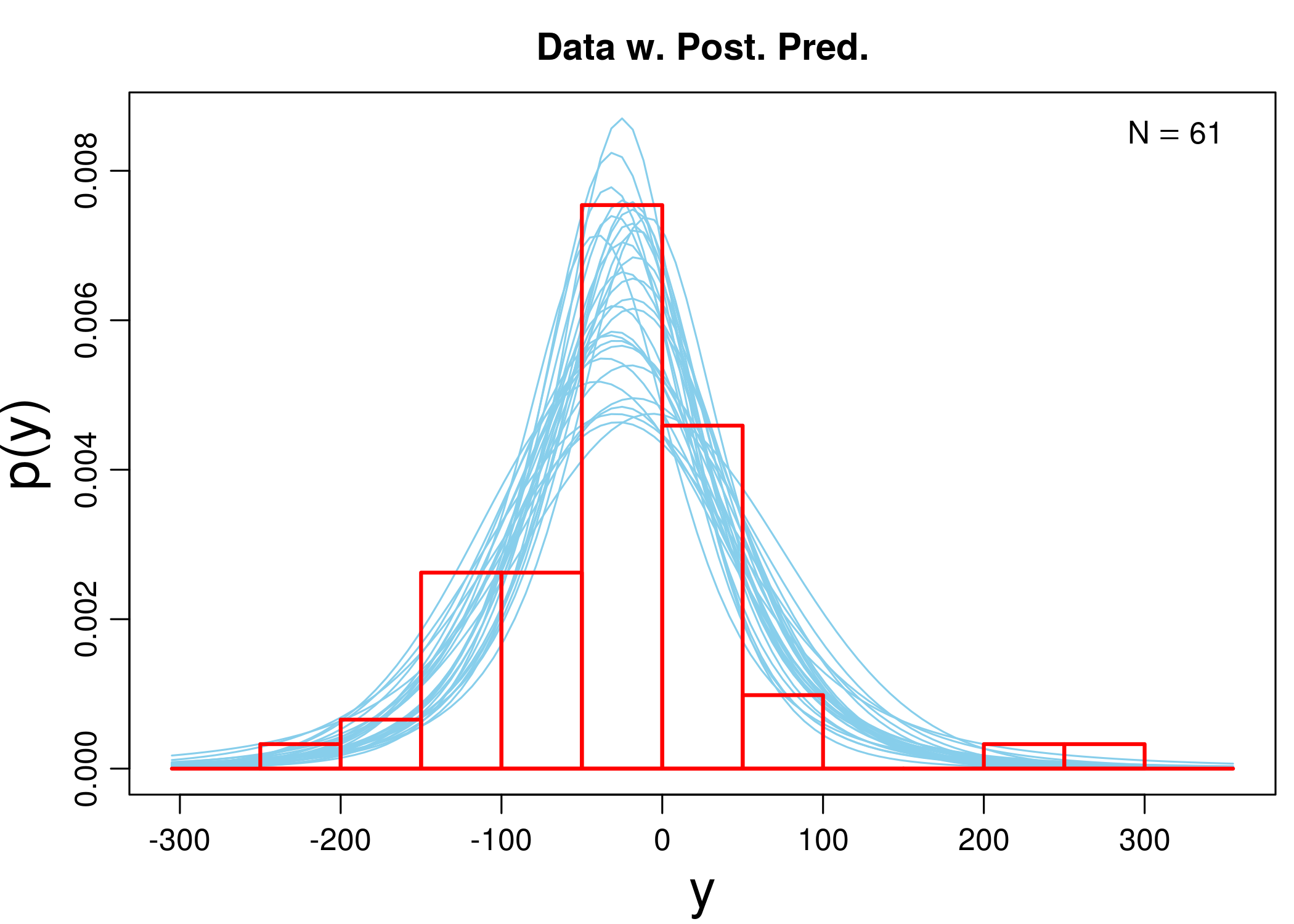
As an example, we go over in detail over the estimation of the impact of data for three narrow attacks on the wide prior. We built the sample of simulated posterior probabilities and plotted the t-distributions of 30 random steps in the approximation process together with a histogram of the data, so that we can estimate how the simulations converged. Actually, since BEST simulations are computationally heavy, we have already run them separately and loaded the file with the results. However, normally you would use a line like the one listed (these simulations take the more time the larger the dataset).
mc3w <- BESTmcmc(sh3, priors = priorsWide)
plotPostPred(mc3w)
print(mc3w)
## MCMC fit results for BEST analysis:
## 100002 simulations saved.
##          mean     sd  median    HDIlo  HDIup  Rhat n.eff
## mu    -24.476  9.063 -24.327 -42.4760 -6.859 1.000 48767
## nu      9.626 12.988   5.275   0.9163 33.326 1.001  2867
## sigma  61.398 11.533  61.081  39.6685 84.249 1.000  9530
##
## 'HDIlo' and 'HDIup' are the limits of a 95% HDI credible interval.
## 'Rhat' is the potential scale reduction factor (at convergence, Rhat=1).
## 'n.eff' is a crude measure of effective sample size.


 The simulation, among other things, produces out a sample of 100002 simulated posterior distributions of the mean, $\mu$. Below we briefly describe how the algorithm works.
- Potential parameter candidates are “locations” that can be visited, and as the algorithm “travels”, it writes down the visited ones.
- The algorithm starts with a random candidate $\theta_1$ for a parameter, say, that the real mean activity change is 5. It writes down $\theta_1$ in the list of “places visited”.
- It calculates the probability (density) for the observations on the assumption that $\theta_1$ indeed is the real mean activity change. This results in $p(D\vert \theta_1)$.
- However, what is important is $p(\theta_1\vert D)$, the extent to which the data supports the claim that $\theta_1$ is the right parameter. This, by Bayes’ Theorem, is related to $p(D\vert \theta_1)$ by means of Bayes’ theorem: \begin{align}\label{eq:bayes} p(\theta_1\vert D) & = \frac{p(D\vert \theta_1)p(\theta)}{p(D)} \end{align}
- Now, $p(D)$ is notoriously difficult to calculate in many cases. The general problem is that for the continuous case we have $p(D) = \int d \theta p(D\vert \theta) p (\theta)$ and this integral can be analytically unsolvable. However, what the simulation needs is something proportional to the right-hand side above, and so what is used is simply $p(D\vert \theta_1)p(\theta)$: the likelihood times the prior. We call the result $p’(\theta_1)$.
- Next, the algorithm considers another randomly drawn potential parameter $\theta_2$ in the neighborhood of $\theta_1$ and calculates $p’(\theta_2)$. If it is greater than $p’(\theta_1)$, it moves its location to $\theta_2$ with certainty, otherwise, it decides to move there with some non-extreme probability only (its value is a meta-parameter chosen to optimize the algorithm convergence).
- Then it draws randomly another potential parameter in the neighborhood of wherever it ended up, and proceeds as before. This is done for a large number of steps.
- The procedure, repeated multiple times, yields a long list of potential parameters visited, and the frequency with which the algorithm visits certain range of potential parameters is proportionate to the probability of these parameters being the true parameters given the data. After normalization, a probability density for the list is obtained: this is the estimated posterior probability distribution for the parameter in question.
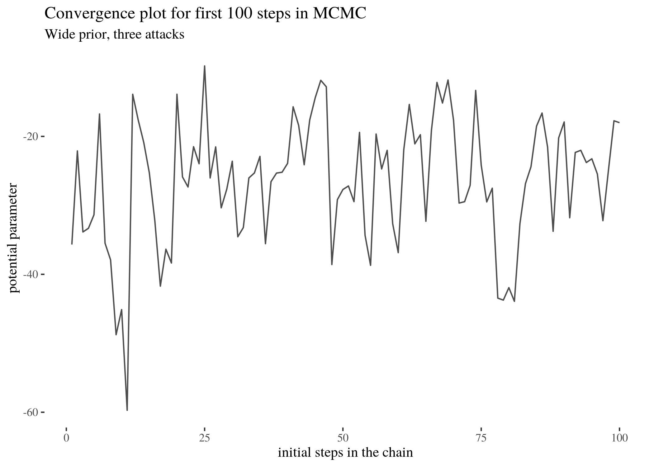
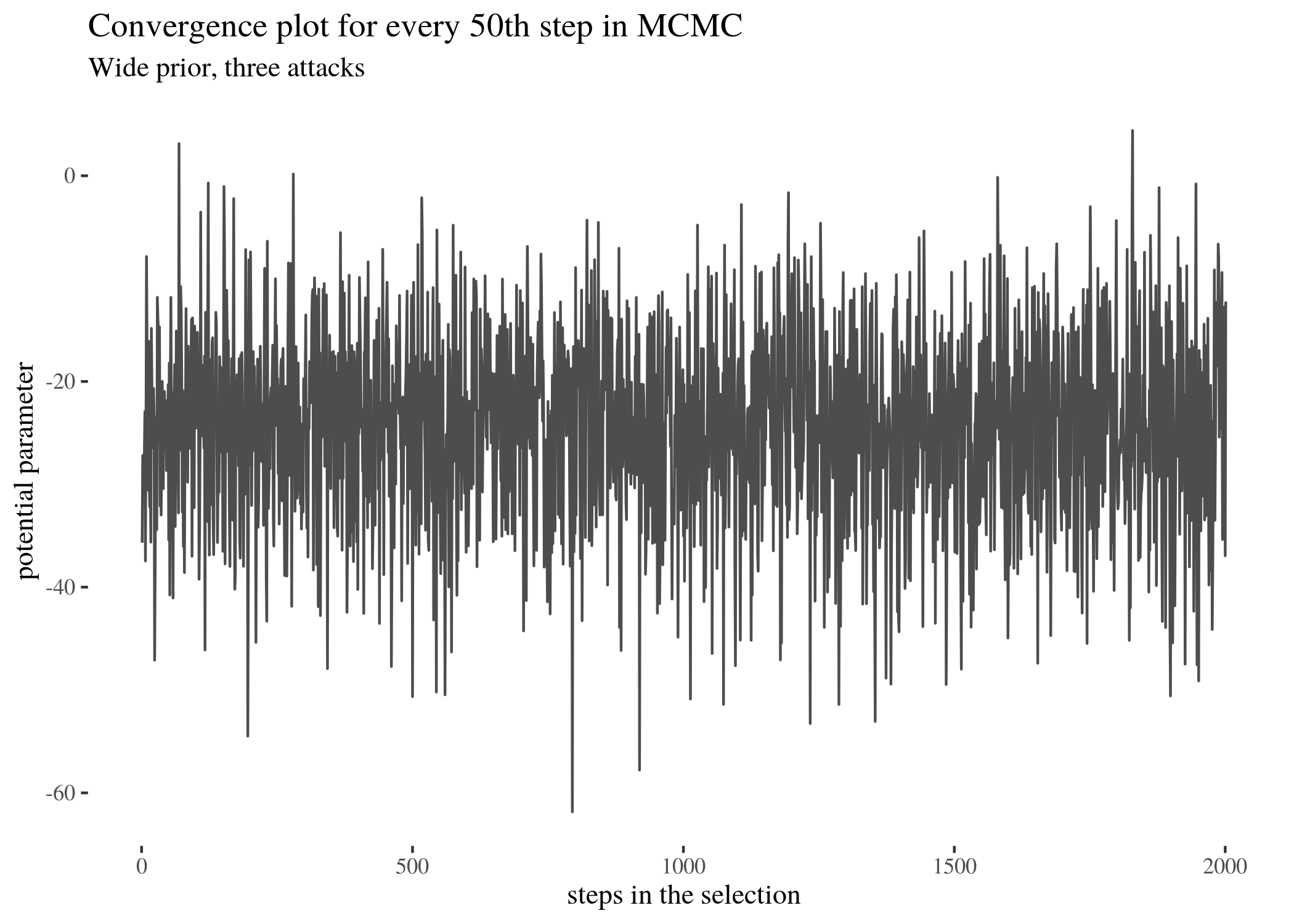
For instance, it is possible to look at which potential parameters the simulation for three attacks visited. Let’s look at the first 100 steps in the full simulation and parameters visited at every 50th step (because a plot of all 100000 steps would not be clearly readable).
ggplot() + geom_line(aes(x = 1:length(mc3w$mu[1:100]), y = mc3w$mu[1:100]),
    alpha = 0.7) + th + xlab("initial steps in the chain") +
    ylab("potential parameter") + labs(title = "Convergence plot for first 100 steps in MCMC",
    subtitle = "Wide prior, three attacks")
conv <- mc3w$mu[seq(1, length(mc3w$mu), by = 50)]
ggplot() + geom_line(aes(x = 1:length(conv), y = conv), alpha = 0.7) +
    th + xlab("steps in the selection") + ylab("potential parameter") +
    labs(title = "Convergence plot for every 50th step in MCMC",
        subtitle = "Wide prior, three attacks")
We can collapse the plot, ignoring time, with default BESTmcmc features and obtain the following plot:
plot(mc3w)
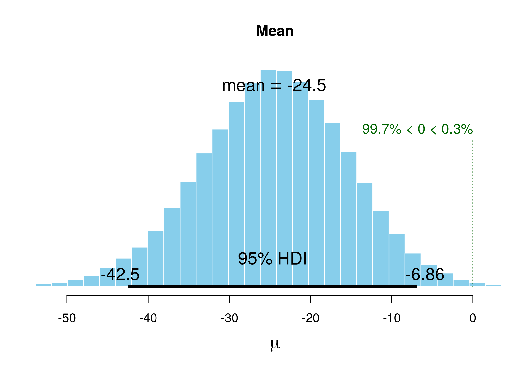
The histogram illustrates the distribution of the outcome. HDI with limits is displayed at the bottom, and the information in green represents the proportion of the sample that is below 0.
Rhat is a convergence measure, if the process goes well it should be around 1, and n.eff is the effective sample size - which is often lower than the actual full sample because of autocorrelation (in simulations next guess for a parameter depends to some extent on what the previous guess was, and the calculation of n.eff corrects for this).
Visual inspection of Figure reveals that the most visited locations (potential mean activity drops) center around slightly less than minus twenty. In fact, the mean of those visited potential means is -24.476 (although this does not have to be the mean of the sample, which in our case is -25.6065574; rather it is the result of a compromise between the data and the prior). The median is very close. The new elements are HDIlo and HDIup, the limits of the Highest Density Inverval: the range of values that are most credible and cover 95% of the distribution. The Values within the 95% HDI are more credible than values outside the HDI, and the values inside it have a total probability of $95\%$. Crucially, these can be interpreted as posterior probabilities of various mean candidates being the population means based on the data, which makes HDI much unlike standard confidence intervals.
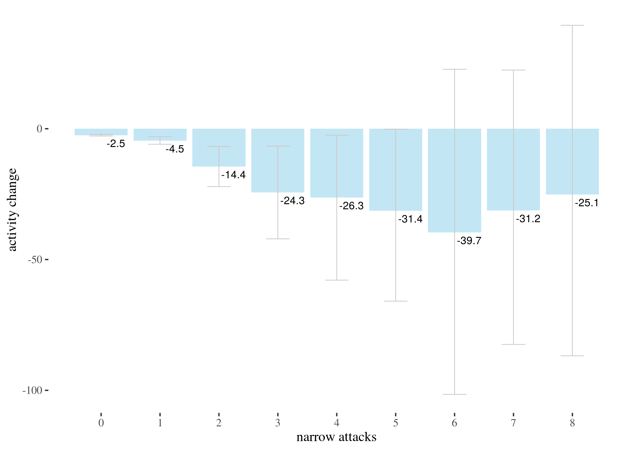
Having gone over a detailed example, we present the results of the Bayesian analysis for 0-9 narrow attacks (and a simulated prior) for three types of priors and the barplot of the means of posterior distributions (not the means of the data, but a result of a compromise between the priors and the data) with HDIs.
# prepare data and plot densities
bayesianWideDF <- data.frame(a0 = mc0w$mu, a1 = mc1w$mu, a2 = mc2w$mu,
    a3 = mc3w$mu, a4 = mc4w$mu, a5 = mc5w$mu, a6 = mc6w$mu, a7 = mc7w$mu,
    a8 = mc8w$mu)
bayesianWideDF$prior <- rnorm(nrow(bayesianWideDF), mean = 0,
    sd = 50)
BayesianWideDFLong <- gather(bayesianWideDF)
BayesianWideDFLong$key <- as.factor(BayesianWideDFLong$key)
BayesianWideDensities <- ggplot(BayesianWideDFLong, aes(x = value,
    group = key, color = key, fill = key)) + geom_density(alpha = 0.2) +
    th + xlab("activity change") + scale_fill_discrete(name = "group",
    labels = c("0 attacks", "1 attack", "2 attacks", "3 attacks",
        "4 attacks", "5 attacks", "6 attacks", "7 attacks", "8 attacks",
        "prior")) + guides(color = FALSE, size = FALSE) + ylim(c(0,
    0.11)) + xlim(c(-90, 60)) + labs(title = "Impact of data on wide prior",
    subtitle = "narrow attacks vs. activity change")

# extract means and HDI limits from the mcmc objects
wideMeans <- numeric(9)
wideLow <- numeric(9)
wideHigh <- numeric(9)
for (i in 1:9) {
    wideMeans[i] <- eval(parse(text = paste("summary(mc", i -
        1, "w)[1]", sep = "")))
    wideLow[i] <- eval(parse(text = paste("summary(mc", i - 1,
        "w)[21]", sep = "")))
    wideHigh[i] <- eval(parse(text = paste("summary(mc", i -
        1, "w)[26]", sep = "")))
}

# order the data and make the barplot
wideBayesTable <- round(data.frame(attacks = 0:8, wideLow, wideMeans,
    wideHigh), 3)
wideBayesBar <- ggplot(wideBayesTable) + geom_bar(aes(x = attacks,
    y = wideMeans), stat = "identity", fill = "skyblue", alpha = 0.5) +
    geom_errorbar(aes(x = attacks, ymin = wideLow, ymax = wideHigh),
        width = 0.4, colour = "seashell3", alpha = 0.9, size = 0.3) +
    th + xlab("narrow attacks") + ylab("activity change") + geom_text(aes(x = attacks +
    0.24, y = wideMeans - 3, label = round(wideMeans, 1)), size = 3) +
    scale_x_continuous(labels = 0:8, breaks = 0:8)
bayesianFittedDF <- data.frame(a0 = mc0f$mu, a1 = mc1f$mu, a2 = mc2f$mu,
    a3 = mc3f$mu, a4 = mc4f$mu, a5 = mc5f$mu, a6 = mc6f$mu, a7 = mc7f$mu,
    a8 = mc8f$mu)
bayesianFittedDF$prior <- rnorm(nrow(bayesianFittedDF), mean = -1.11,
    sd = 7.5)
BayesianFittedDFLong <- gather(bayesianFittedDF)
BayesianFittedDFLong$key <- as.factor(BayesianFittedDFLong$key)
BayesianFittedDensities <- ggplot(BayesianFittedDFLong, aes(x = value,
    group = key, color = key, fill = key)) + geom_density(alpha = 0.2) +
    th + xlab("activity change") + scale_fill_discrete(name = "group",
    labels = c("0 attacks", "1 attack", "2 attacks", "3 attacks",
        "4 attacks", "5 attacks", "6 attacks", "7 attacks", "8 attacks",
        "prior")) + guides(color = FALSE, size = FALSE) + ylim(c(0,
    0.12)) + xlim(c(-35, 20)) + labs(title = "Impact of data on fitted prior",
    subtitle = "narrow attacks vs. activity change")

fittedMeans <- numeric(9)
fittedLow <- numeric(9)
fittedHigh <- numeric(9)

for (i in 1:9) {
    fittedMeans[i] <- eval(parse(text = paste("summary(mc", i -
        1, "f)[1]", sep = "")))
    fittedLow[i] <- eval(parse(text = paste("summary(mc", i -
        1, "f)[21]", sep = "")))
    fittedHigh[i] <- eval(parse(text = paste("summary(mc", i -
        1, "f)[26]", sep = "")))
}

fittedBayesTable <- round(data.frame(attacks = 0:8, fittedLow,
    fittedMeans, fittedHigh), 3)
fittedBayesBar <- ggplot(fittedBayesTable) + geom_bar(aes(x = attacks,
    y = fittedMeans), stat = "identity", fill = "skyblue", alpha = 0.5) +
    geom_errorbar(aes(x = attacks, ymin = fittedLow, ymax = fittedHigh),
        width = 0.4, colour = "seashell3", alpha = 0.9, size = 0.3) +
    th + xlab("narrow attacks") + ylab("activity change") + geom_text(aes(x = attacks +
    0.25, y = fittedMeans - 1, label = round(fittedMeans, 1)),
    size = 3) + scale_x_continuous(labels = 0:8, breaks = 0:8)


# ______________________________
bayesianInformativeDF <- data.frame(a0 = mc0i$mu, a1 = mc1i$mu,
    a2 = mc2i$mu, a3 = mc3i$mu, a4 = mc4i$mu, a5 = mc5i$mu, a6 = mc6i$mu,
    a7 = mc7i$mu, a8 = mc8i$mu)
bayesianInformativeDF$prior <- rnorm(nrow(bayesianInformativeDF),
    mean = -1.11, sd = 44.47)
BayesianInformativeDFLong <- gather(bayesianInformativeDF)
BayesianInformativeDFLong$key <- as.factor(BayesianInformativeDFLong$key)
BayesianInvormativeDensities <- ggplot(BayesianInformativeDFLong,
    aes(x = value, group = key, color = key, fill = key)) + geom_density(alpha = 0.2) +
    th + xlab("activity change") + scale_fill_discrete(name = "group",
    labels = c("0 attacks", "1 attack", "2 attacks", "3 attacks",
        "4 attacks", "5 attacks", "6 attacks", "7 attacks", "8 attacks",
        "prior")) + guides(color = FALSE, size = FALSE) + ylim(c(0,
    0.11)) + xlim(c(-90, 50)) + labs(title = "Impact of data on Informative prior",
    subtitle = "narrow attacks vs. activity change")


InformativeMeans <- numeric(9)
InformativeLow <- numeric(9)
InformativeHigh <- numeric(9)

for (i in 1:9) {
    InformativeMeans[i] <- eval(parse(text = paste("summary(mc",
        i - 1, "i)[1]", sep = "")))
    InformativeLow[i] <- eval(parse(text = paste("summary(mc",
        i - 1, "i)[21]", sep = "")))
    InformativeHigh[i] <- eval(parse(text = paste("summary(mc",
        i - 1, "i)[26]", sep = "")))
}

InformativeBayesTable <- round(data.frame(attacks = 0:8, InformativeLow,
    InformativeMeans, InformativeHigh), 3)

InformativeBayesBar <- ggplot(InformativeBayesTable) + geom_bar(aes(x = attacks,
    y = InformativeMeans), stat = "identity", fill = "skyblue",
    alpha = 0.5) + geom_errorbar(aes(x = attacks, ymin = InformativeLow,
    ymax = InformativeHigh), width = 0.4, colour = "seashell3",
    alpha = 0.9, size = 0.3) + th + xlab("narrow attacks") +
    ylab("activity change") + geom_text(aes(x = attacks + 0.25,
    y = InformativeMeans - 3, label = round(InformativeMeans,
        1)), size = 3) + scale_x_continuous(labels = 0:8, breaks = 0:8)
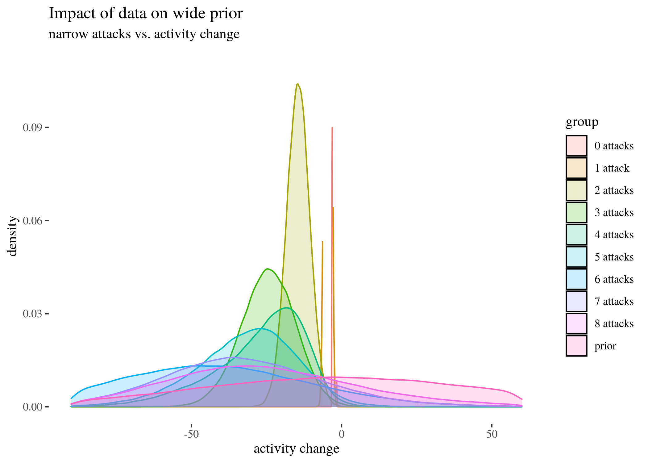
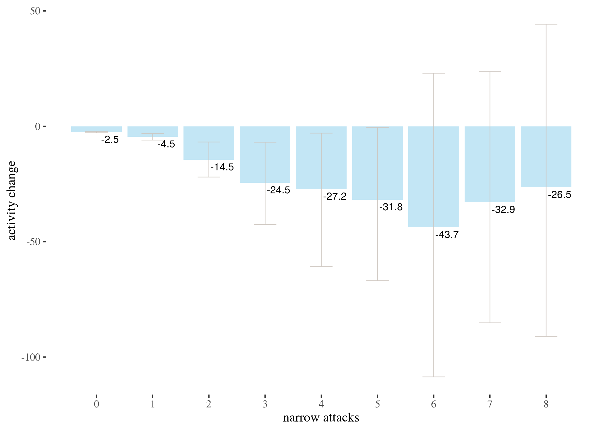
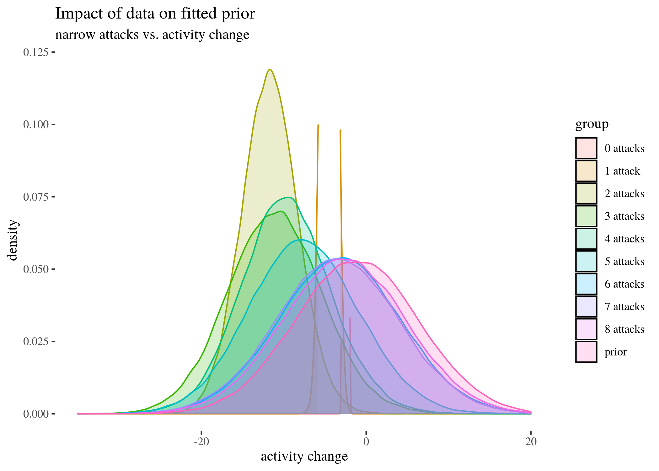
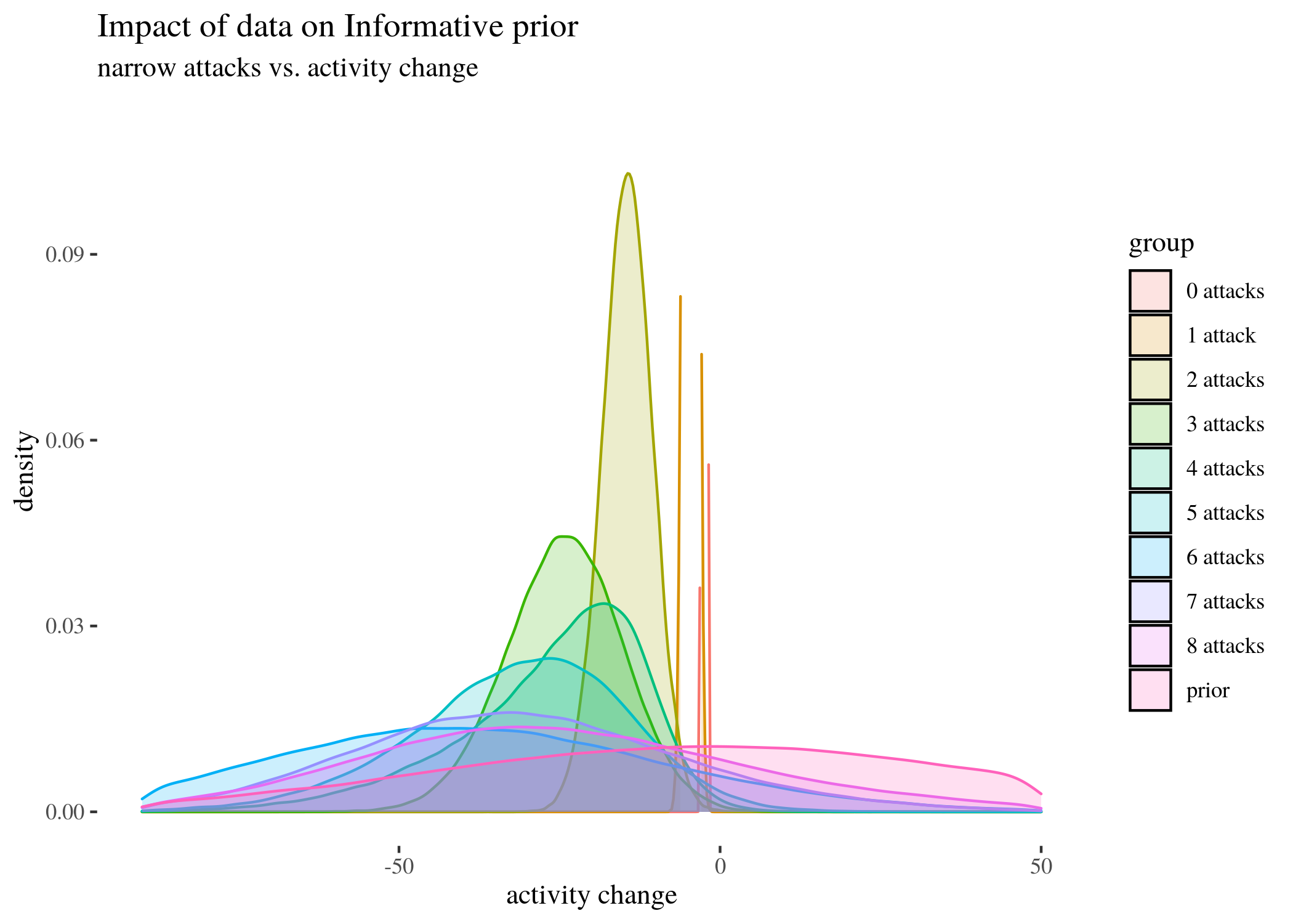
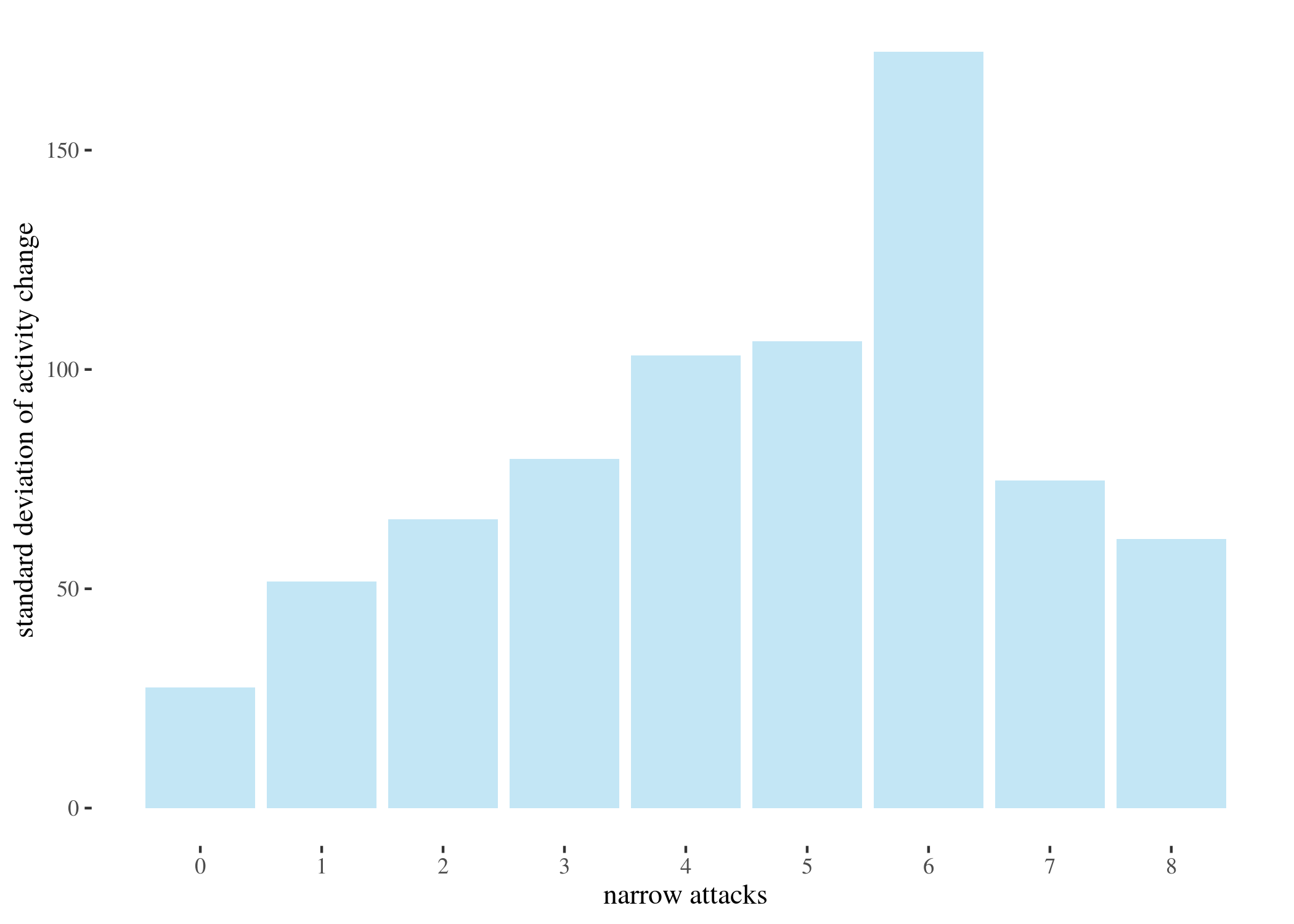
The near-vertical lines represent the density for 0 attacks, which goes high up — plotting the whole range of $y$ axis would make the rest of the plot unintelligible. As the number of attacks grow, no matter which prior we start with, the posterior means move left (which agrees with the results we obtained with other methods) and the density plots become wider. This is partially because the groups become smaller as the number of attacks increases, and partially because the standard deviations between the groups are uneven (users who received more attacks seem to display more uneven behavior – this is one of the reasons we decided to look at groups by numbers of attacks, instead of trying to fit a regressions line).
 sds <- c(sd(sh0), sd(sh1), sd(sh2), sd(sh3), sd(sh4), sd(sh5),
     sd(sh6), sd(sh7), sd(sh8))
 attacks <- 0:8

 ggplot() + geom_bar(aes(x = attacks, y = round(sds, 2)), stat = "identity",
     fill = "skyblue", alpha = 0.5) + th + xlab("narrow attacks") +
     ylab("standard deviation of activity change") + scale_x_continuous(breaks = 0:8,
     labels = 0:8)
Model-theoretic analysis
We analyzed the correlation between attacks received and activity change using classical and bayesian methods. However, there is a number of predictors we have not yet used. The impact of some of them, such as the number of attacks on posts written by an author, could provide further insight. More importantly, some of them might be confounding variables. Crucially, since previous activity seems to be a good predictor of future activity and since high number of attacks received in the before period correlates with high activity before, one might be concerned that whatever explaining the value of high attacks before does in our analysis should actually be attributed simply to activity
To reach some clarity on such issues, we perform a regression analysis to see how the predictors in best fit models interact, and to use the model parameters to get some comparison of the impact they have. We build a number of potentially viable generalized linear regression models meant to predict ctivityAfter based on a selection of other variables, pick the best one(s) and analyze what they reveal about the predictors involved.
library(MASS)
library(vcd)
library(lmtest)
library(countreg)
library(pscl)
library(stats)
Our first challenge was finding the right distribution for the outcome variable.
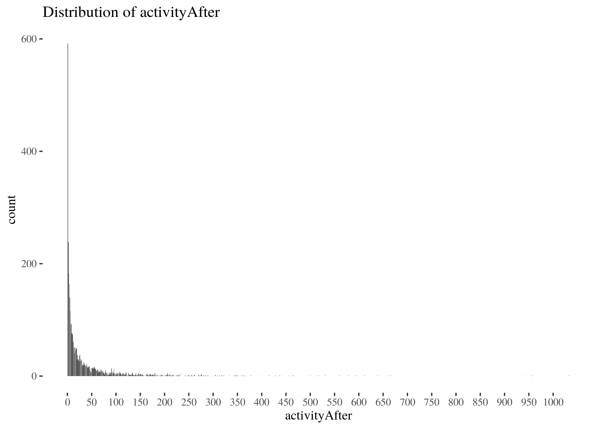
activityAfterTab <- table(factor(data$activityAfter, levels = 0:max(data$activityAfter)))
activityAfterDf <- as.data.frame(activityAfterTab)
activityAfterDf$Var1 <- as.integer(activityAfterDf$Var1)
activityDistr <- ggplot(activityAfterDf, aes(x = Var1, y = Freq)) +
geom_bar(stat = "identity") + scale_x_continuous(breaks = seq(0,
1000, by = 50)) + th + labs(title = "Distribution of activityAfter") +
xlab("activityAfter") + ylab("count")
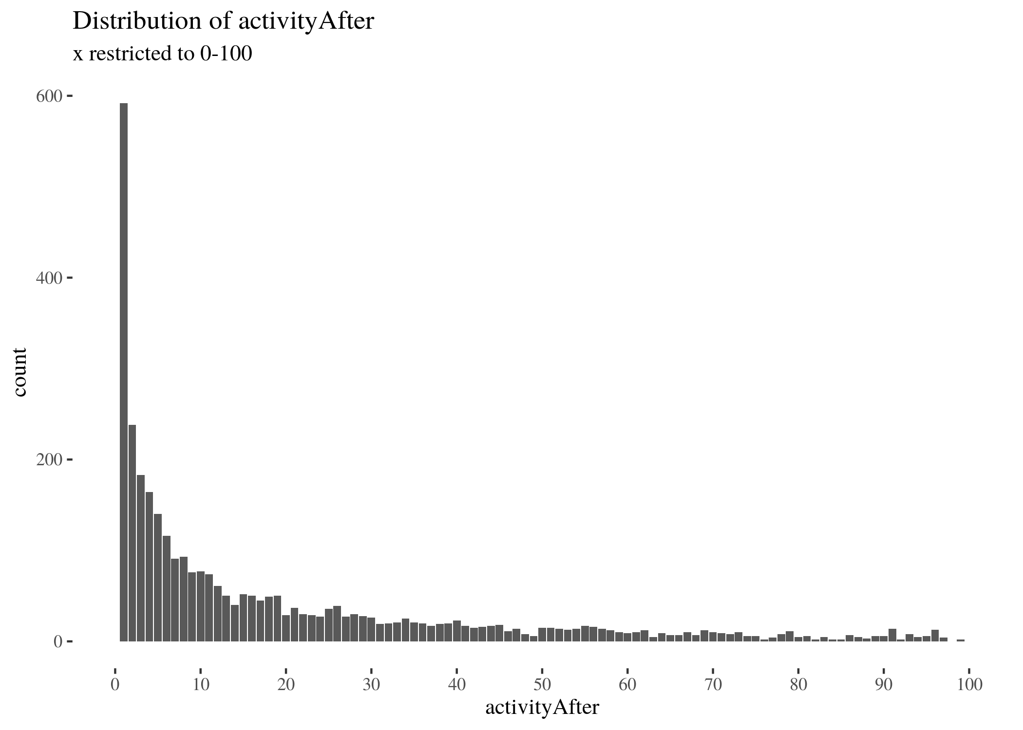
activityDistrRestr <- ggplot(activityAfterDf, aes(x = Var1, y = Freq)) +
geom_bar(stat = "identity") + scale_x_continuous(breaks = seq(0,
100, by = 10), limits = c(0, 100)) + th + labs(title = "Distribution of activityAfter",
subtitle = "x restricted to 0-100") + xlab("activityAfter") +
ylab("count")
activityDistr
activityDistrRestr
One potential candidate was the Poisson distribution. We identified the Poisson distribution that best fits the data, used its $\lambda$ parameter ($\approx 35.69$) to perform a goodness-of-fit test (with $df=273$, $\chi^2 \approx \infty$ and $P(>\chi^2)\approx 0$), and compare visually the predicted values with the actual ones.
activityFitPois <- goodfit(activityAfterTab, type = "poisson")
unlist(activityFitPois$par)
summary(activityFitPois)
activityFitPois <- goodfit(activityAfterTab, type = "poisson")
poissonFitPlot <- ggplot(activityAfterDf, aes(x = Var1, y = Freq)) +
    geom_bar(stat = "identity", alpha = 0.6) + scale_x_continuous(breaks = seq(0,
    100, by = 10), limits = c(0, 100)) + th + labs(title = "activityAfter with fitted best Poisson model predictions",
    subtitle = "x restricted to 0-100") + xlab("activityAfter") +
    ylab("count") + geom_point(aes(x = Var1, y = activityFitPois$fitted),
    colour = "darksalmon", size = 0.5, alpha = 0.5)
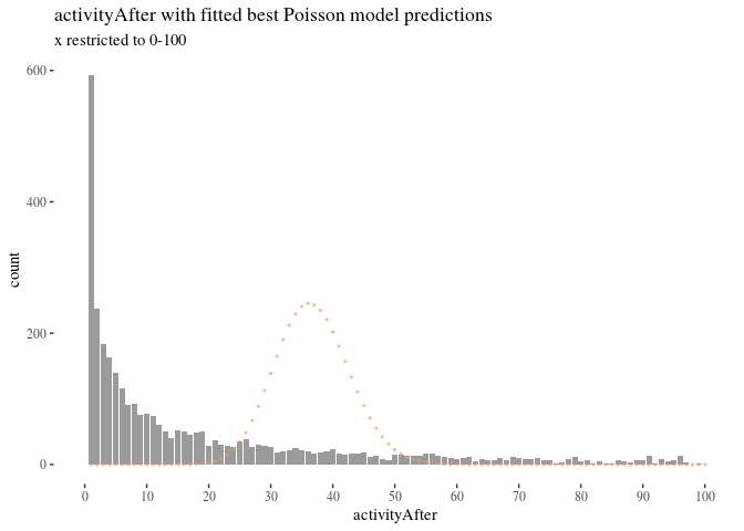
There were at least two problems: zero-inflation and overspread. The former means that the model predicts much fewer zeros than there really are in the data, and the latter means that the model predicts fewer higher values than there are in the data. The best fitting $\lambda$ was fairly high and moved the highest values of Poisson too far to the right compared to where they were expected. Over-dispersion could be handled by moving to a quasi-Poisson distribution, but this would not help us much with the zero counts.
 activityFitNbin <- goodfit(activityAfterTab, type = "nbinom")
 summary(activityFitNbin)
 ##
 ##   Goodness-of-fit test for nbinomial distribution
 ##
 ##                       X^2  df     P(> X^2)
 ## Likelihood Ratio 647.9633 272 1.045879e-32
 activityFitNbin <- goodfit(activityAfterTab, type = "nbinom")
 poissonNbinPlot2 <- ggplot(activityAfterDf, aes(x = Var1, y = Freq)) +
     geom_bar(stat = "identity", alpha = 0.5) + scale_x_continuous(breaks = seq(0,
     100, by = 10), limits = c(0, 100)) + th + labs(title = "activityAfter with fitted best negative binomial model predictions",
     subtitle = "x restricted to 0-100") + xlab("activityAfter") +
     ylab("count") + geom_point(aes(x = Var1, y = activityFitNbin$fitted),
     colour = "darksalmon", size = 0.5, alpha = 0.8)
poissonNbinPlot2
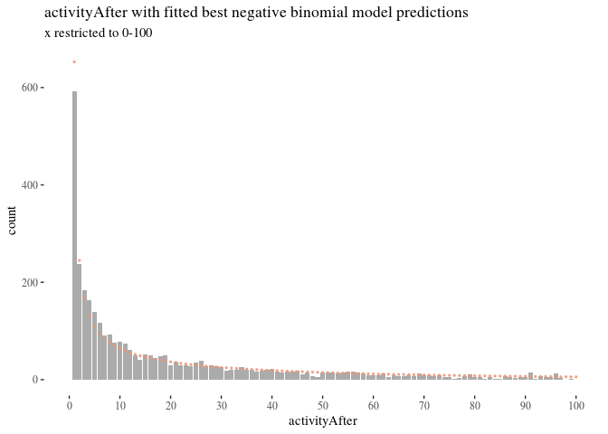
Another candidate distribution we considered was negative binomial. There still were problems with zeros although in the opposite direction though), the goodness-of-fit test resulted in $\chi^2 \approx 647$ and $P(>\chi^s)\approx 0$, but the right side of the Figure \ref{fig:nbinperf} looks better. This suggested that improvements were still needed.
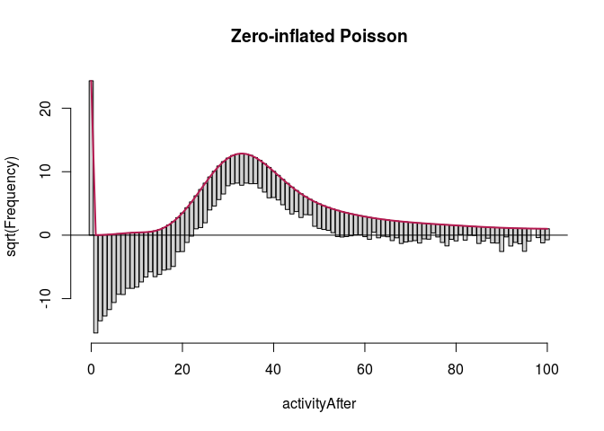
There are two well-known strategies to develop distributions for data with high zero counts: zero-inflated and hurdle models. In a zero-inflated Poisson (ZIP) model (Lambert 1992) a distinction is made between the structural zeros for which the output value will always be 0, and the rest, sometimes giving random zeros. A ZIP model is comprised of two components:
- A model for the binary event of membership in the class where 0 is necessary. Typically, this is logistic regression.
- A Poisson (or negative binomial) model for the remaining observed count, potentially including some zeros as well. Typically a log link is used to predict the mean.
In hurdle models (proposed initially by Cragg (1971) and developed further by Mullahy (1986)) the idea is that there may be some special “hurdle” required to reach a positive count. The model uses:
- A logistic regression submodel to distinguish counts of zero from larger counts, and
- Truncated Poisson (or negative binomial) regression for the positive counts excluding the zero counts.
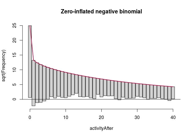
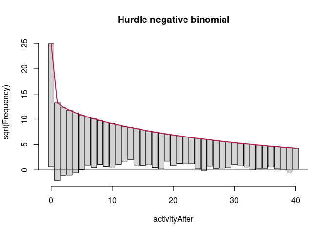
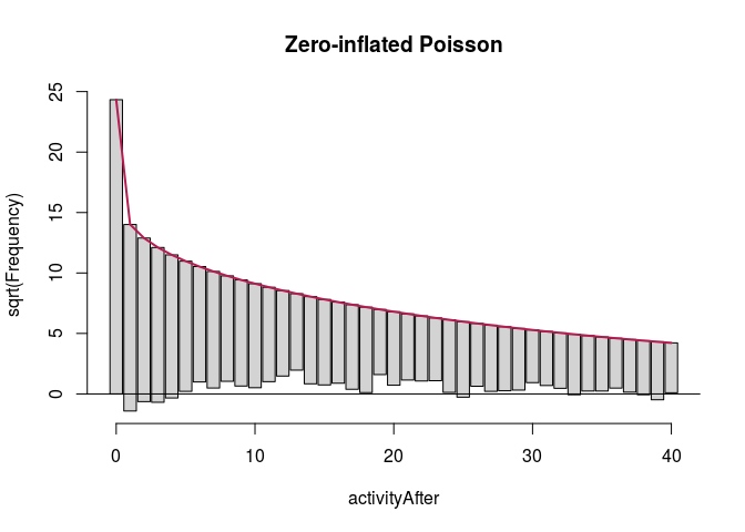
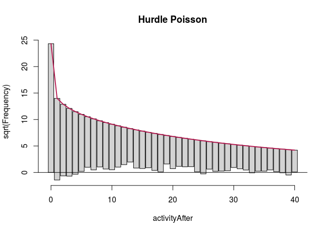
We start with the full predictor sets. We display rootograms (they have \emph{squared} frequencies on the $y$-axis to increase the visibility of lower counts) for the models.
data$sumLowOnlyBefore <- data$sumLowBefore - data$sumHighBefore

fullModelZINbin <- zeroinfl(activityAfter ~ sumLowOnlyBefore +
    sumHighBefore + sumPlBefore + sumPhBefore + activityBefore,
    data = data, dist = "negbin")

fullModelHNbin <- hurdle(activityAfter ~ sumLowOnlyBefore + sumHighBefore +
    sumPlBefore + sumPhBefore + activityBefore, data = data,
    dist = "negbin")

fullModelZIpois <- zeroinfl(activityAfter ~ sumLowOnlyBefore +
    sumHighBefore + sumPlBefore + sumPhBefore + activityBefore,
    data = data, dist = "poisson")

fullModelHpois <- hurdle(activityAfter ~ sumLowOnlyBefore + sumHighBefore +
    sumPlBefore + sumPhBefore + activityBefore, data = data,
    dist = "poisson")
fullModelZINbinRoot <- countreg::rootogram(fullModelZINbin, max = 100,
    main = "Zero-inflated negative binomial")

fullModelHNbinRoot <- countreg::rootogram(fullModelHNbin, max = 100,
    main = "Hurdle negative binomial")

fullModelZIpoisRoot <- countreg::rootogram(fullModelZIpois, max = 100,
    main = "Zero-inflated Poisson")

fullModelHpoisRoot <- countreg::rootogram(fullModelHpois, max = 100,
    main = "Hurdle Poisson")
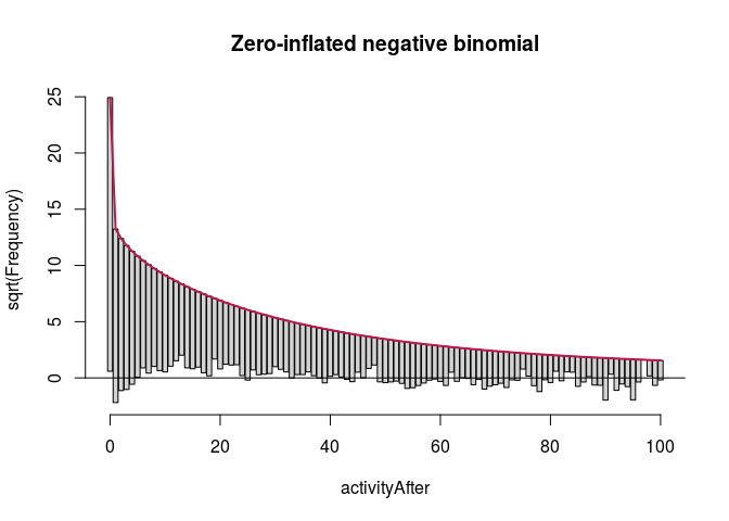


autoplot(fullModelZINbinRoot, alpha = 0.5) + th + ylab("Square root of couts") +
    ggtitle("Zero-inflated negative binomial")
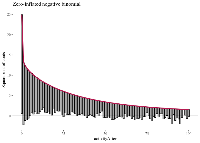
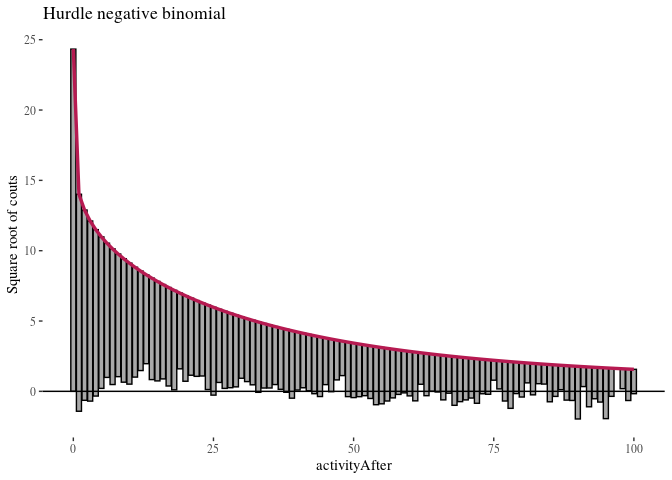


The first observation was that even zero-inflation or hurdling do not improve the Poisson distribution much. The second was that once we use negative binomial distribution, it does not seem to make much of a difference whether we use zero-inflation or hurdling. We investigated this further. One method of comparing such models is the Vuong test which produced $z$-statistic ($2.08$ with $p\approx 0.018$) suggesting the zero-inflated negative binomial model is better than hurdle negative binomial. However, the differences in log-likelihood (14459 vs. 14527) and AIC (28945 vs. 29081) were not large.
Let’s compare the models using some known methods.
vuong(fullModelZINbin, fullModelHNbin)
## Vuong Non-Nested Hypothesis Test-Statistic:
## (test-statistic is asymptotically distributed N(0,1) under the
##  null that the models are indistinguishible)
## -------------------------------------------------------------
##               Vuong z-statistic             H_A  p-value
## Raw                    2.089478 model1 > model2 0.018332
## AIC-corrected          2.089478 model1 > model2 0.018332
## BIC-corrected          2.089478 model1 > model2 0.018332
logLik(fullModelZINbin)
## 'log Lik.' -14459.65 (df=13)
AIC(fullModelZINbin)
## [1] 28945.3
logLik(fullModelHNbin)
## 'log Lik.' -14527.69 (df=13)
AIC(fullModelHNbin)
## [1] 29081.39
There seem to be some reasons to prefer the zero-inflated model, but the score differences are not too impressive, both likelihood ratios are Akaike scores are very close (note: we want to minimize AIC and maximize log likelihood).
To move on we need to modify the variables, because some of the counts included others. This was not a problem so far, but now we will be looking in detail at their roles jointly, and so it is important to not count various things multiple times.
# select variables of interest
dataModeling <- data %>%
    dplyr::select(sumLowOnlyBefore, sumHighBefore, sumPlBefore,
        sumPhBefore, activityBefore, activityAfter)

# sum narrow now becomes sum of narrow attacks on comments
dataModeling$sumHighBefore <- dataModeling$sumHighBefore - dataModeling$sumPhBefore

# sum wide only now becomes sum of wide only on comments
dataModeling$sumLowOnlyBefore <- dataModeling$sumLowOnlyBefore -
    dataModeling$sumPlBefore

# sum of wide on posts now becomes sum of wide only on
# posts
dataModeling$sumPlBefore <- dataModeling$sumPlBefore - dataModeling$sumPhBefore
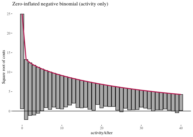
We build zero-inflated negative binomial and hurdle negative binomial models, one with all variables, and one based on previous activity only. If we can get equally good predictions using previous activity only and ignoring information about attacks, this would suggest no impact of the other variables.
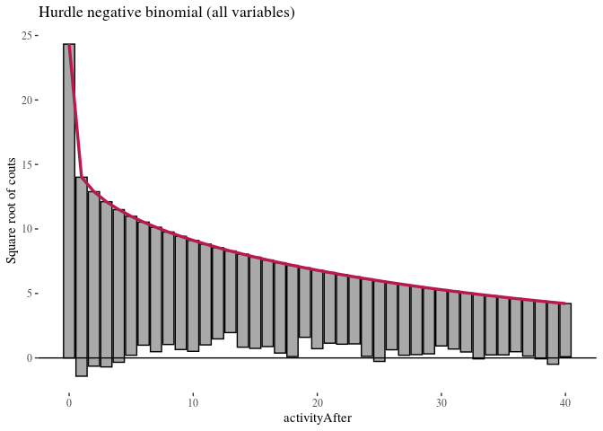
The outcome variable has third quartile of weekly activity count in the after period at 38, and we are mostly interested in predictive accuracy where most of the users are placed. Therefore, we look at what happens with these models up to 40.
ZNBfullRoot <- countreg::rootogram(ZNBfull, max = 40, main = "Zero-inflated negative binomial")

ZNBactivityRoot <- countreg::rootogram(ZNBactivity, max = 40,
    main = "Hurdle negative binomial")

HNBfullRoot <- countreg::rootogram(HNBfull, max = 40, main = "Zero-inflated Poisson")

HNBactivityRoot <- countreg::rootogram(HNBactivity, max = 40,
    main = "Hurdle Poisson")
autoplot(ZNBfullRoot, alpha = 0.5) + th + ylab("Square root of couts") +
    ggtitle("Zero-inflated negative binomial (all variables)")

autoplot(HNBfullRoot, alpha = 0.5) + th + ylab("Square root of couts") +
    ggtitle("Hurdle negative binomial (all variables)")
autoplot(ZNBactivityRoot, alpha = 0.5) + th + ylab("Square root of couts") +
    ggtitle("Zero-inflated negative binomial (activity only)")
autoplot(HNBactivityRoot, alpha = 0.5) + th + ylab("Square root of couts") +
    ggtitle("Hurdle negative binomial (activity only)")

Here, zero-inflated models under-predict low non-zero counts, while hurdle models are a bit better in this respect, so we will focus on them. It is more difficult to see any important difference between the two hurdle models. We compare them using likelihood ratio test.
For each selection of variables, we first pick the value of parameters in the model that maximizes the probability density of the data given this choice of variables and these parameters (likelihood). We do this for two nested models, then we take the log of the ratio of these, and we get a measure of how well, comparatively, they fit the data. Moreover, multiplying this ratio by -2, we obtain a statistic that has a $\chi^2$ distribution, which can be further used to r calculate the p-value for the null hypothesis that the added variables make no difference.
Log-likelihood test results in $\chi^2 \approx 20.28$, with $P(>\chi^2)\approx 0.009$. Wald’s test is somewhat similar (ableit more generally applicable). It also indicates that the additional variables are significant ($\chi^2 \approx 24.71$ with $P(>\chi^2)\approx 0.0017$), which suggests that variables other than previous activity are also significant.
Finally, Akaike Information Criterion (Akaike, 1974) provides an estimator of out-of-sample prediction error and penalizes more complex models. As long as we evaluate models with respect to the same data, the ones with lower Akaike score should be chosen. Even with penalty for the additional variables, the full model receives better score (although the difference is not very large, 29,081 vs. 29,085).
First, we can do this in a step-wise manner:
library(lmtest)
likHNBactivity <- logLik(HNBactivity)
likHNBfull <- logLik(HNBfull)
(teststat <- -2 * (as.numeric(likHNBactivity) - as.numeric(likHNBfull)))
## [1] 20.28267
df <- 13 - 5
(p.val <- pchisq(teststat, df = df, lower.tail = FALSE))
## [1] 0.009317915
The same result can be achieved more quickly using the following lines:
lrtest(HNBactivity, HNBfull)
## Likelihood ratio test
##
## Model 1: activityAfter ~ activityBefore
## Model 2: activityAfter ~ .
##   #Df LogLik Df  Chisq Pr(>Chisq)
## 1   5 -14538
## 2  13 -14528  8 20.283   0.009318 **
## ---
## Signif. codes:  0 '***' 0.001 '**' 0.01 '*' 0.05 '.' 0.1 ' ' 1
waldtest(HNBactivity, HNBfull)
## Wald test
##
## Model 1: activityAfter ~ activityBefore
## Model 2: activityAfter ~ .
##   Res.Df Df  Chisq Pr(>Chisq)
## 1   3668
## 2   3660  8 24.714   0.001738 **
## ---
## Signif. codes:  0 '***' 0.001 '**' 0.01 '*' 0.05 '.' 0.1 ' ' 1
AIC(HNBactivity)
## [1] 29085.67
AIC(HNBfull)
## [1] 29081.39
Next, we inspect the HNB model and interpret the result.
HNBfull
##
## Call:
## hurdle(formula = activityAfter ~ ., data = dataModeling, dist = "negbin")
##
## Count model coefficients (truncated negbin with log link):
##      (Intercept)  sumLowOnlyBefore     sumHighBefore       sumPlBefore
##         2.534167         -0.009021         -0.007607          0.015150
##      sumPhBefore    activityBefore
##        -0.139336          0.015018
## Theta = 0.7734
##
## Zero hurdle model coefficients (binomial with logit link):
##      (Intercept)  sumLowOnlyBefore     sumHighBefore       sumPlBefore
##         0.490741         -0.009813         -0.111728         -0.104510
##      sumPhBefore    activityBefore
##         0.144576          0.080384


The output is split into two submodels: one for predicting zeros, one for the counts. It could be suggested to ignore those variables whose coefficients are not  statistically significant, but given the already discussed reasons to include these variables, we are not going to do this (in fact, attaching too much value to statistical significance thresholds can be pernicious, and also misleading if the predictors are correlated, as attacks on posts and attacks on comments may well be). Moreover, the results of step-wise elimination from the full model are sensitive to the ordering in which we consider variables, and there is no principled reason to prefer any of the orderings. Instead, interpreting  $p$-values we apply the following advice: the closer it is to 1, the more skeptical we should be about the judgment the model makes about its role.\footnote{See the excellent book titled \emph{The Cult of Statistical Significance: How the Standard Error Costs Us Jobs, Justice, and Lives} by Stephen T. Ziliak and Deirdre N. McCloskey.}
The coefficeints  are somewhat difficult to interpret because the models use log link function. Therefore  we first   exponentiate them to obtain odds ratios:

``` r
expCoef <- as.data.frame(round((exp(coef((HNBfull)))), 3))
colnames(expCoef) <- c("Odds ratios")
expCoef
```

    ##                        Odds ratios
    ## count_(Intercept)           12.606
    ## count_sumLowOnlyBefore       0.991
    ## count_sumHighBefore          0.992
    ## count_sumPlBefore            1.015
    ## count_sumPhBefore            0.870
    ## count_activityBefore         1.015
    ## zero_(Intercept)             1.634
    ## zero_sumLowOnlyBefore        0.990
    ## zero_sumHighBefore           0.894
    ## zero_sumPlBefore             0.901
    ## zero_sumPhBefore             1.156
    ## zero_activityBefore          1.084
Next we analyze the intercepts of the count submodel. The baseline number of posts for those who are not in the zero class is 12.6. The coefficients indicate that the multiplicative contribution of each unit change. For instance:
- Each additional wide only attack on a user decreases the baseline by factor of .991. So, other things being equal, receiving 10 wide attacks only would decrease a user’s activity by $100 \times (1-.991^{10}) \approx 8.6\%$.
- The impact of narrow attacks on comments is similar.
- Interestingly, wide only attacks on post actually increase activity, at least for those who are not in the zero class. For instance, four of them would increase the activity by $100\times (1-1.006^4) \approx 2.4\%$.
- The strongest impact is due to narrow only attacks on posts. Even one of them decreases one’s expected activity by $14\%$, thus, receiving receiving five of them reduces one’s expected activity by $50\%$.
Next, regarding the zero submodel.
- The basic odds for not posting for the whole week are 1.63. This means that the probability of belonging to the zero class is $\frac{1.63\,}{1+1.63}\approx 0.61$.
- wide only attacks, narrow attacks on comments, wide only attacks on posts all decrease the chances in being in the zero class.
- In contrast, receiving narrow attacks on posts has a strong impact, increasing the chances of not posting anything next week. For instance, with the baseline odds 1.63, if one receives five such attacks, other things being equal, her chances of not posting for a week go to $\frac{(1.63\times 1.15^5 }{1+(1.63\times 1.15^5)}\approx .76$.
- Interestingly, posting in the previous week makes one slightly more likely to not post the next week. One’s baseline probability of being active, $1-0.61 = 0.39$ goes to $1-\frac{1.63 \times 1.08^20}{1+1.63 \times 1.08^20} \approx 0.22$ if in the preceding week one wrote on \textsf{Reddit} 20 times, other things being equal.
We visualise the effects of selected variables by plotting what activity levels the model predicts for their different values (we focus on 0-40, as the top of this range is already an extrapolation), while keeping other variables fixed at their mean values.
sumLowOnlyBefore <- rep(mean(dataModeling$sumLowOnlyBefore),
    4001)
sumHighBefore <- rep(mean(dataModeling$sumHighBefore), 4001)
sumPlBefore <- rep(mean(dataModeling$sumPlBefore), 4001)
sumPhBefore <- rep(mean(dataModeling$sumPhBefore), 4001)
activityBefore <- rep(mean(dataModeling$activityBefore), 4001)
activityAfter <- rep(mean(dataModeling$activityAfter), 4001)

baseEffDf <- data.frame(sumLowOnlyBefore, sumHighBefore, sumPlBefore,
    sumPhBefore, activityBefore, activityAfter)

effSizePlot <- function(columnno, range = 40, by = 5) {
    EffDf <- baseEffDf
    EffDf[, columnno] <- 0:4000
    EffDf$prediction <- predict(HNBfull, EffDf)
    ggplot(EffDf, aes(x = EffDf[, columnno], y = prediction)) +
        geom_smooth(alpha = 0.5, col = "skyblue", se = FALSE) +
        scale_x_continuous(breaks = seq(0, range, by = by), limits = c(-1,
            range)) + th + ylab("predicted activity")
}

effLO <- effSizePlot(1, 500, 50)  #low only
effH <- effSizePlot(2, 50, 5)  #narrow on comments
effPl <- effSizePlot(3, 100, 10)  #pl
effPh <- effSizePlot(4, 50, 5)  #ph
effA <- effSizePlot(5, 200, 20)  #abefore
effLO + ggtitle("Predicted (hurdle) effect of wide only attacks on comments") +
    xlab("wide only attacks")
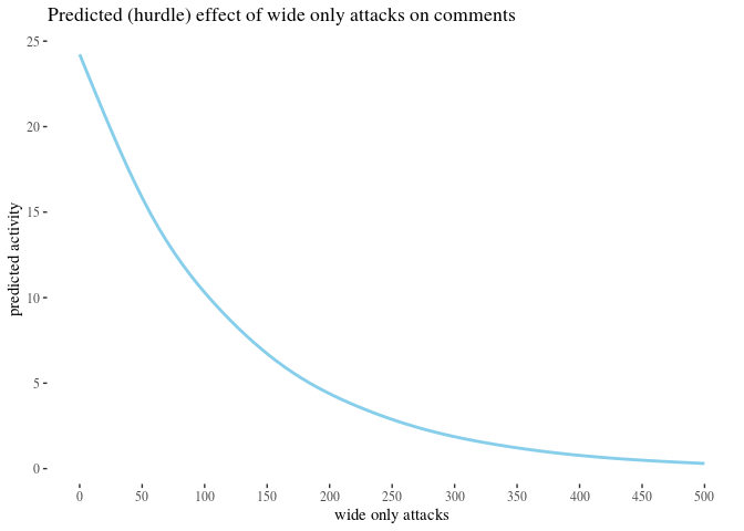
effH + ggtitle("Predicted (hurdle) effect of narrow attacks on comments") +
    xlab("narrow attacks")
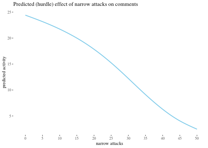
effPl + ggtitle("Predicted (hurdle) effect of wide attacks on posts") +
    xlab("wide attacks")
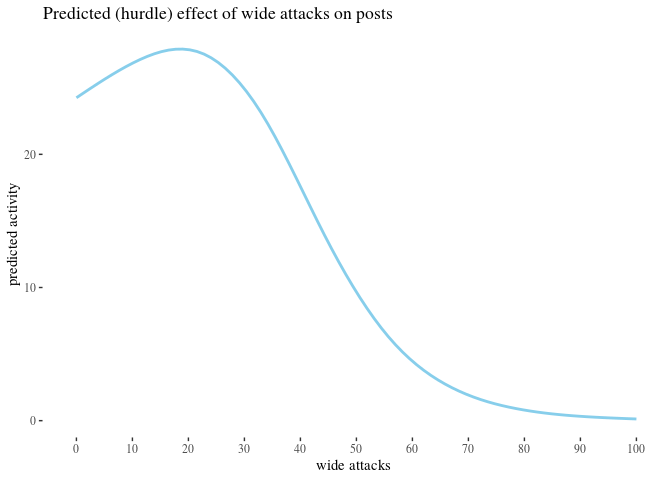
effPh + ggtitle("Predicted (hurdle) effect of narrow attacks on posts") +
    xlab("narrow attacks")
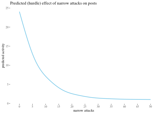
effA + ggtitle("Predicted (hurdle) effect of previous activity") +
    xlab("activity before")
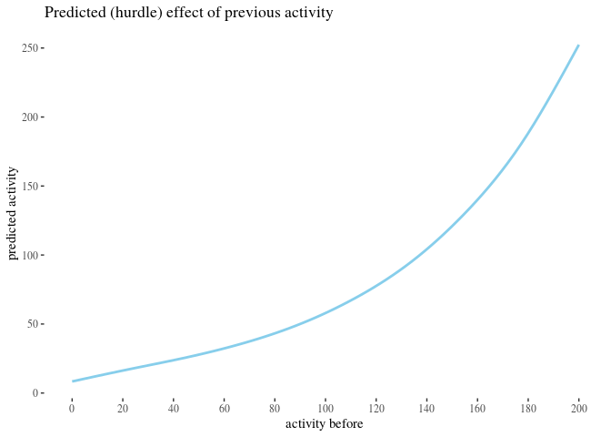
Finally, to make sure our choice to use the hurdle model was not crucial for these results, we also provide effect plots for the full zero-inflated model.
effSizePlotZ <- function(columnno, range = 40, by = 5) {
    EffDf <- baseEffDf
    EffDf[, columnno] <- 0:4000
    EffDf$prediction <- predict(ZNBfull, EffDf)
    ggplot(EffDf, aes(x = EffDf[, columnno], y = prediction)) +
        geom_smooth(alpha = 0.5, col = "skyblue", se = FALSE) +
        scale_x_continuous(breaks = seq(0, range, by = by), limits = c(-1,
            range)) + th + ylab("predicted activity")
}

effLOZ <- effSizePlotZ(1, 500, 50)  #wide only
effHZ <- effSizePlotZ(2, 50, 5)  #high on comments
effPlZ <- effSizePlotZ(3, 100, 10)  #pl
effPhZ <- effSizePlotZ(4, 50, 5)  #ph
effAZ <- effSizePlotZ(5, 200, 20)  #abefore
effLOZ + ggtitle("Predicted (zero-inflated) effect of wide only attacks on comments") +
    xlab("wide only attacks")
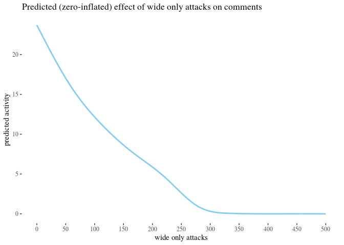
effHZ + ggtitle("Predicted (zero-inflated) effect of narrow attacks on comments") +
    xlab("narrow attacks")
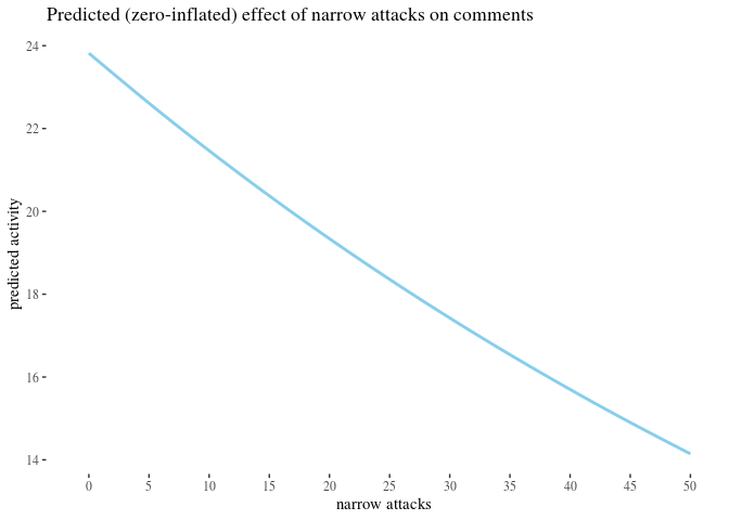
effPlZ + ggtitle("Predicted (zero-inflated) effect of wide attacks on posts") +
    xlab("wide attacks")
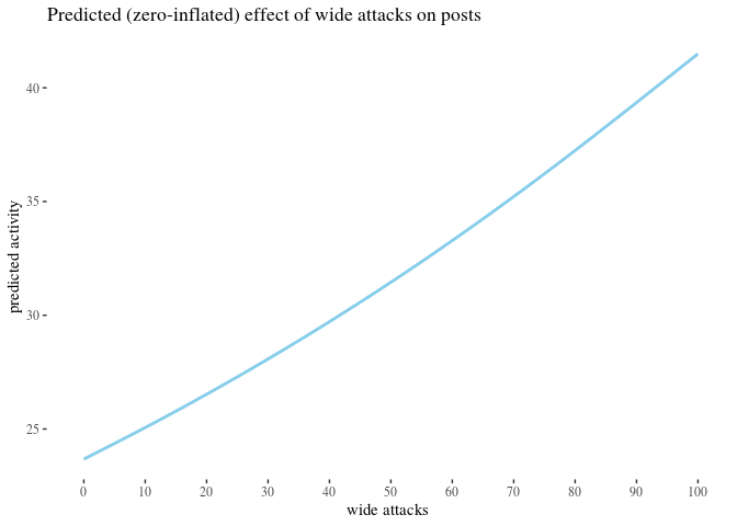
effPhZ + ggtitle("Predicted (zero-inflated) effect of narrow attacks on posts") +
    xlab("narrow attacks")
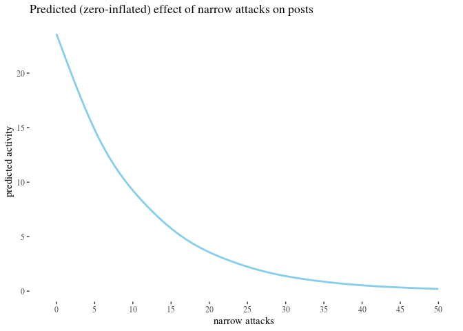
effAZ + ggtitle("Predicted (zero-inflated) effect of previous activity") +
    xlab("activity before")
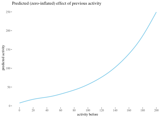
Another way to use this information is to inspect the table of activity counts that the model expects based on the number of personal attacks on a post received in the before period, assuming all the other input variables are kept at their mean values:
EffSumHighTable <- baseEffDf[0:20, ]
EffSumHighTable[, 4] <- 0:19
EffSumHighTable$prediction <- predict(HNBfull, EffSumHighTable)
EffTablePosts <- rbind(EffSumHighTable$sumPhBefore, round(EffSumHighTable$prediction))
rownames(EffTablePosts) <- c("attacks", "expected activity")
EffTablePosts
##                   [,1] [,2] [,3] [,4] [,5] [,6] [,7] [,8] [,9] [,10] [,11]
## attacks              0    1    2    3    4    5    6    7    8     9    10
## expected activity   24   22   19   17   15   13   11   10    9     8     7
##                   [,12] [,13] [,14] [,15] [,16] [,17] [,18] [,19] [,20]
## attacks              11    12    13    14    15    16    17    18    19
## expected activity     6     6     5     5     4     4     3     3     3
The predictions are similar, except for the predicted results of wide only attacks on posts. This perhaps can be explained by observing that such cases of personal attacks sometimes represent situations in which the users actually agree with the original post (see our remark in the beginning of the section about data gathering and selection), and in some cases the attacks are critical of the author, so there is much more variation in this group and precise modeling is harder.
It should be kept in mind that the model is built on up to 27 attacks in the before period, with really low number of attacks above 8, so the prediction here is an extrapolation, not an interpolation. Further studies for longer periods are needed to get a more reliable estimate allowing for interpolation in this respect.
One might have reasoned about our previous analyses as follows: attacks in the before period correlate with activity before, and it is activity before that is the real predictor of activity after. This could be supported by observing that the p-value for the hurdle model is really low for activity before. Pearson correlation coefficient for narrow attacks before and activity before is r(3671)≈ 0.437 and r(3671)≈ 0.332 for activity after. However, activity before is a much better correlate of activity after, r(3671)≈ 0.845 — all correlations with p-value <2.2e − 16, and regression analysis (inspect the effect plots) indicates that activity before and high attacks before actually go in the opposite directions.
Regression to the mean?
Another problem plaguing observational studies is \textbf{regression to the mean}. If the probability of any particular message being attacked is fairly low, users who have received an attack are quite likely to have posted more content than the treatment group, and perhaps those who posted more content in the before period are more likely to post less in the after period. This concern might be elevated by the observation that activity before indeed increases with the number of attacks received and that the activity drop increases with activity before.
attacksb <- 0:8
maxb <- max(attacks)
lowb <- numeric(max + 1)
highb <- numeric(max + 1)
mb <- numeric(max + 1)
pb <- numeric(max + 1)
tb <- list()

for (attacks in attacksb) {
    t[[attacks + 1]] <- t.test(data[data$sumHighBefore == attacks,
        ]$activityBefore)

    lowb[attacks + 1] <- t[[attacks + 1]]$conf.int[1]
    highb[attacks + 1] <- t[[attacks + 1]]$conf.int[2]
    mb[attacks + 1] <- t[[attacks + 1]]$estimate
    pb[attacks + 1] <- t[[attacks + 1]]$p.value
}
highTableb <- as.data.frame(round(rbind(0:8, lowb, mb, highb,
    pb), 3))
rownames(highTableb) <- c("attacks", "CIlow", "estimatedm", "CIhigh",
    "p-value")

before <- as.data.frame(t(highTableb))

attacksa <- 0:8
maxa <- max(attacksa)
lowa <- numeric(max + 1)
higha <- numeric(max + 1)
ma <- numeric(max + 1)
pa <- numeric(max + 1)
ta <- list()
for (attacks in attacksa) {
    ta[[attacks + 1]] <- t.test(data[data$sumHighBefore == attacks,
        ]$activityAfter)
    lowa[attacks + 1] <- ta[[attacks + 1]]$conf.int[1]
    higha[attacks + 1] <- ta[[attacks + 1]]$conf.int[2]
    ma[attacks + 1] <- ta[[attacks + 1]]$estimate
    pa[attacks + 1] <- ta[[attacks + 1]]$p.value
}
highTablea <- as.data.frame(round(rbind(0:8, lowa, ma, higha,
    pa), 3))
rownames(highTablea) <- c("attacks", "CIlow", "estimatedm", "CIhigh",
    "p-value")
after <- as.data.frame(t(highTablea))

ggplot(before, aes(x = attacks, y = estimatedm)) + geom_point() +
    geom_errorbar(aes(ymin = CIlow, ymax = CIhigh), width = 0.2,
        size = 0.2, position = position_dodge(0.05)) + th + xlab("narrow attacks") +
    ylab("mean activity") + geom_line(data = after, aes(x = attacks,
    y = estimatedm), color = "skyblue") + geom_errorbar(data = after,
    aes(ymin = CIlow, ymax = CIhigh), width = 0.3, size = 0.2,
    color = "skyblue", position = position_dodge(0.05))
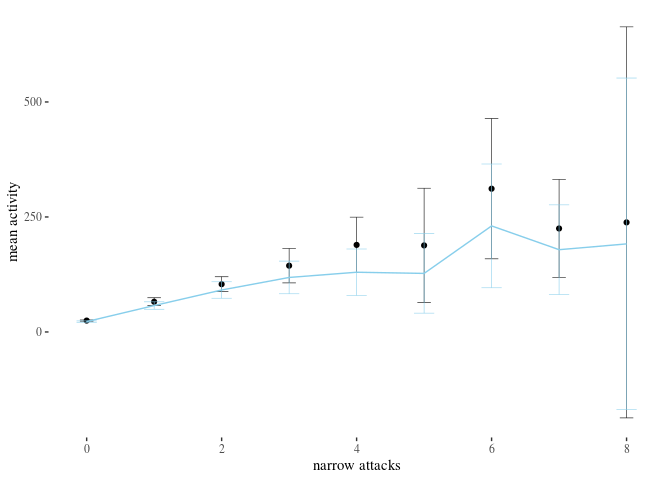

We visually inspect the relation between the distance from the sample mean for activityBefore and the activity change between week 1 and week 2, grouped by the number of attacks received (for the cases for which we obtained significant results in the classical analysis).
h0 <- data[data$sumHighBefore == 0, ]
h1 <- data[data$sumHighBefore == 1, ]
h2 <- data[data$sumHighBefore == 2, ]
h3 <- data[data$sumHighBefore == 3, ]
h4 <- data[data$sumHighBefore == 4, ]

distance <- function(x) {
    x - mean(data$sumHighBefore)
}

library(gridExtra)
grid.arrange(ggplot(h0, aes(x = distance(activityBefore), y = activityDiff)) +
    geom_point(alpha = 0.3, size = 1, position = "jitter") +
    geom_smooth(size = 0.5, alpha = 0.5) + th + xlab("distance from sample mean") +
    ggtitle("0 narrow attacks") + ylab("activity change"), ggplot(h2,
    aes(x = distance(activityBefore), y = activityDiff)) + geom_point(alpha = 0.3,
    size = 1, position = "jitter") + geom_smooth(size = 0.5,
    alpha = 0.5) + th + xlab("distance from sample mean") + ggtitle("2 narrow attacks") +
    ylab("activity change"), ggplot(h3, aes(x = distance(activityBefore),
    y = activityDiff)) + geom_point(alpha = 0.3, size = 1, position = "jitter") +
    geom_smooth(size = 0.5, alpha = 0.5) + th + xlab("distance from sample mean") +
    ggtitle("3 narrow attacks") + ylab("activity change"), ggplot(h4,
    aes(x = distance(activityBefore), y = activityDiff)) + geom_point(alpha = 0.3,
    size = 1, position = "jitter") + geom_smooth(size = 0.5,
    alpha = 0.5) + th + xlab("distance from sample mean") + ggtitle("4 narrow attacks") +
    ylab("activity change"))
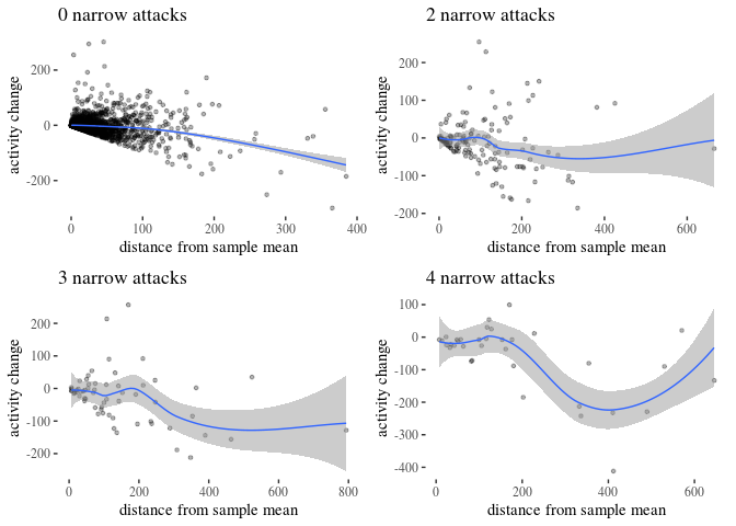
First, in an inspection of the control group, the smoothing might suggest some correlation between the distance from the mean and the activity drop. However, the sharp cut-off at the bottom is there because one cannot drop their activity below the previous activity level. So users closer to the mean didn’t even have the lower options available, and this restriction might be partially responsible for the smoothing line going downwards. Moreover, Spearman correlation between the distance from the mean and the activity change is -0.269, which is fairly weak. Pearson’s ρ is not very different ( -0.255), but we need to be careful here, because the relation doesn’t seem very linear (p-values for correlation tests are both <0.001). If, however, we follow this line of reasoning, the distance from the mean would explain only R2= 0.065 of the variability in the activity change in the control group.
The impression of regression to the mean disappears when we look at activityScore, that is, activity change in proportion to previous activity.
h0 <- data[data$sumHighBefore == 0, ]
h1 <- data[data$sumHighBefore == 1, ]
h2 <- data[data$sumHighBefore == 2, ]
h3 <- data[data$sumHighBefore == 3, ]
h4 <- data[data$sumHighBefore == 4, ]

distance <- function(x) {
    x - mean(data$sumHighBefore)
}

library(gridExtra)
grid.arrange(ggplot(h0, aes(x = distance(activityBefore), y = activityScore)) +
    geom_point(alpha = 0.3, size = 1, position = "jitter") +
    geom_smooth(size = 0.5, alpha = 0.5) + th + xlab("distance from sample mean") +
    ggtitle("0 narrow attacks") + ylab("proportional activity change"),
    ggplot(h2, aes(x = distance(activityBefore), y = activityScore)) +
        geom_point(alpha = 0.3, size = 1, position = "jitter") +
        geom_smooth(size = 0.5, alpha = 0.5) + th + xlab("distance from sample mean") +
        ggtitle("2 narrow attacks") + ylab("proportional activity change"),
    ggplot(h3, aes(x = distance(activityBefore), y = activityScore)) +
        geom_point(alpha = 0.3, size = 1, position = "jitter") +
        geom_smooth(size = 0.5, alpha = 0.5) + th + xlab("distance from sample mean") +
        ggtitle("3 narrow attacks") + ylab("proportional activity change"),
    ggplot(h4, aes(x = distance(activityBefore), y = activityScore)) +
        geom_point(alpha = 0.3, size = 1, position = "jitter") +
        geom_smooth(size = 0.5, alpha = 0.5) + th + xlab("distance from sample mean") +
        ggtitle("4 narrow attacks") + ylab("proportional activity change"))
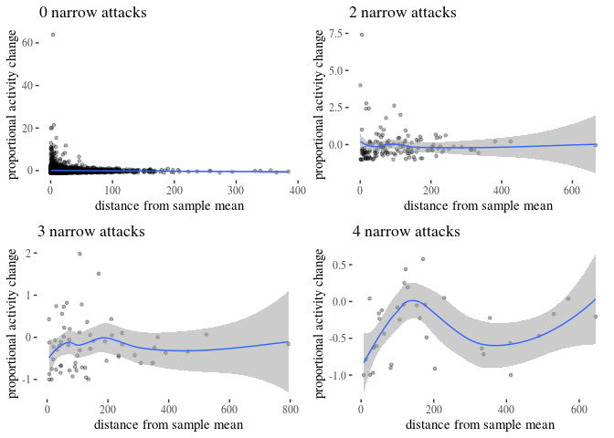
Plots for $>0$ attacks with gam smoothing does not suggest regression to the mean: it is not the case that attacked users with higher activity before indeed tend to have lower activity in the second week.
Next, notice that restricting the dataset to users with similar activity before still results in uneven activity change between the groups. We focus focus on users with \textsf{activityBefore} restricted to the third quartile of the whole sample (44), narrow attacks in ${0,1,2,3, 4} and estimate their \textsf{activityScore} proportional drop.
iqr0 <- data[data$sumHighBefore == 0 & data$activityBefore <=
    44, ]
iqr1 <- data[data$sumHighBefore == 1 & data$activityBefore <=
    44, ]
iqr2 <- data[data$sumHighBefore == 2 & data$activityBefore <=
    44, ]
iqr3 <- data[data$sumHighBefore == 3 & data$activityBefore <=
    44, ]
iqr4 <- data[data$sumHighBefore == 4 & data$activityBefore <=
    44, ]

t.test(iqr0$activityScore)
##
##  One Sample t-test
##
## data:  iqr0$activityScore
## t = 1.2217, df = 2383, p-value = 0.2219
## alternative hypothesis: true mean is not equal to 0
## 95 percent confidence interval:
##  -0.03146482  0.13546981
## sample estimates:
##  mean of x
## 0.05200249
t.test(iqr1$activityScore)
##
##  One Sample t-test
##
## data:  iqr1$activityScore
## t = 0.98047, df = 307, p-value = 0.3276
## alternative hypothesis: true mean is not equal to 0
## 95 percent confidence interval:
##  -0.1174912  0.3508613
## sample estimates:
## mean of x
## 0.1166851
t.test(iqr2$activityScore)
##
##  One Sample t-test
##
## data:  iqr2$activityScore
## t = -0.42513, df = 48, p-value = 0.6726
## alternative hypothesis: true mean is not equal to 0
## 95 percent confidence interval:
##  -0.5275463  0.3433931
## sample estimates:
##  mean of x
## -0.0920766
t.test(iqr3$activityScore)
##
##  One Sample t-test
##
## data:  iqr3$activityScore
## t = -2.4104, df = 12, p-value = 0.03289
## alternative hypothesis: true mean is not equal to 0
## 95 percent confidence interval:
##  -0.68256469 -0.03444387
## sample estimates:
##  mean of x
## -0.3585043
t.test(iqr4$activityScore)
##
##  One Sample t-test
##
## data:  iqr4$activityScore
## t = -5.0454, df = 6, p-value = 0.002344
## alternative hypothesis: true mean is not equal to 0
## 95 percent confidence interval:
##  -1.049450 -0.363969
## sample estimates:
##  mean of x
## -0.7067096
The estimated means of proportional changes are $0.05, 0.11, -0.09,-0.35, -0.7$ with decreasing p-values falling below .05 at the number of attacks $=3, 4$ and $p$-value 0.002 for four attacks (that is, 0.01 with Bonferroni correction for multiple testing), despite the group sizes for three and four attacks being fairly low (49 for two, 13 for three, 7 for four). By the way, note that with this activity restriction, receiving one attack does not seem to have much impact on user’s activity.
Further, to adjust for regression to the mean, it is sometimes recommended to use ANCOVA to correct for prior differences in pretest measurements. In our case, a statistically significant difference for different number of attacks received remains after correcting for differences in activity before.
library(rstatix)
data$fhigh <- as.factor(data$sumHighBefore)
data %>%
    anova_test(activityDiff ~ activityBefore + fhigh)
## ANOVA Table (type II tests)
##
##           Effect DFn  DFd       F         p p<.05   ges
## 1 activityBefore   1 3651 577.220 1.53e-118     * 0.137
## 2          fhigh  20 3651  10.214  1.57e-31     * 0.053
Finally, the model-theoretic analysis already corrects for activity before, and estimates the effect size of the other variables keeping activity before fixed at the mean level. So, regression to the mean, while it might play a small part, does not seem to explain the differences. However, the potential effects of regression to the mean have to be kept in mind in future observational studies and replication attempts.
References
Akaike, H. (1974). A new look at the statistical model identification. IEEE Transactions on Automatic Control, 19(6), 716–723. https://doi.org/10.1109/TAC.1974.1100705
Kruschke, J. (2015). Doing Bayesian data analysis; a tutorial with R, JAGS, and Stan.
Ptaszyński, M., Leliwa, G., Piech, M., & Smywiński-Pohl, A. (2018). Cyberbullying detection–technical report 2/2018, Department of Computer Science AGH, University of Science and Technology. arXiv Preprint arXiv:1808.00926.
Tukey, J. W. (1949). Comparing individual means in the analysis of variance. Biometrics, 5(2), 99. https://doi.org/10.2307/3001913
Valkenburg, P. M., Peter, J., & Schouten, A. P. (2006). Friend networking sites and their relationship to adolescents’ well-being and social self-esteem. CyberPsychology & Behavior, 9(5), 584–590. https://doi.org/10.1089/cpb.2006.9.584
Wise, K., Hamman, B., & Thorson, K. (2006). Moderation, response rate, and message interactivity: Features of online communities and their effects on intent to participate. Journal of Computer-Mediated Communication, 12(1), 24–41. https://doi.org/10.1111/j.1083-6101.2006.00313.x
Wroczynski, M., & Leliwa, G. (2019). System and method for detecting undesirable and potentially harmful online behavior. Google Patents.
Zong, W., Yang, J., & Bao, Z. (2019). Social network fatigue affecting continuance intention of social networking services. Data Technologies and Applications. https://doi.org/10.1108/dta-06-2018-0054
[1] https://www.samurailabs.ai/, described in (Ptaszyński, Leliwa, Piech, & Smywiński-Pohl, 2018; Wroczynski & Leliwa, 2019).